

Services


SEO vs SEM – What’s the Difference?
December 17, 2015
How to Earn More with Your Twitter Profile? 5 Effective Techniques
December 25, 2015A Brief Guide to Your Responsive Web Design
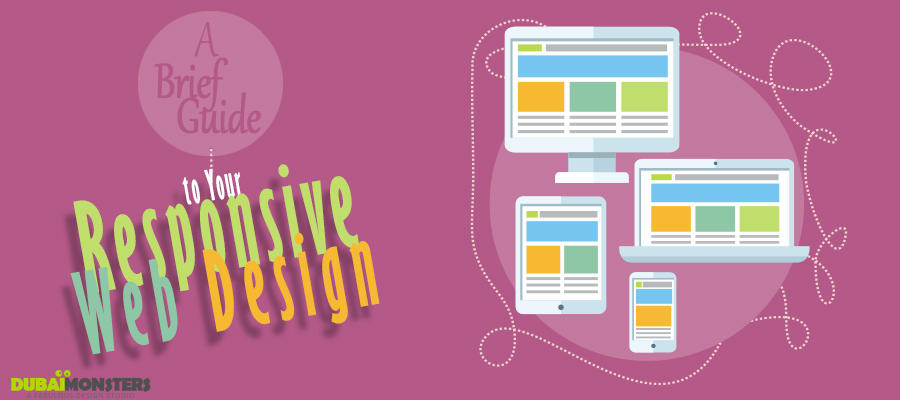
Responsive web design is an approach to design your website mobile friendly. This is a practice that consists up of flexible grids and layouts, images and intelligent use of data. As a user switches to its cellular device, the image size resolution and scripting abilities adjust accordingly to the small screen. This allows website to respond according to the user’s preference.
With new gadgets and screen sizes introduced it is considered foremost important to adjust the screen resolution for website. For many websites creating a new version for smaller screen sounds odd, thus upgrading your site to a responsive version helps you cater variety of customers including predominant mobile users.
Adobe Edge
This is a tool to inspect how your site will appear across different platforms, it was formerly called as Adobe Shadow. Instead of testing your site on individual gadgets try this tool to view how your site will appear on different platforms.
Simple Grid
This is another simple tool that allows you to deliver all the elements of a traditional website to various types of mobile screens.
Adaptive Images
Website differs from device to device; this depends upon the screen size and resolution. Adaptive images detect the screen size of the user and rescale the version that fits the screen perfectly.
Foundation
For designers who want to craft sites for mobile devices foundation can be a handy tool to consider. This tool also helps speed up the loading time.
How to adjust image resolution?
The images on the website can be customized for mobile devices using a tool called Retina image. This tool helps serve different image resolutions based on the user device. This tool sends a high or low image resolution depending upon the cookie values.
Apart from tools mentioned above there are numerous other to figure out responsive web design. Bootstrap is also one of those which bring web designers together to contribute in web projects. It gives a fun way to enjoy and experiment with the web design. For any query contact us, our web design professionals are just one call away. Let us build your website.

