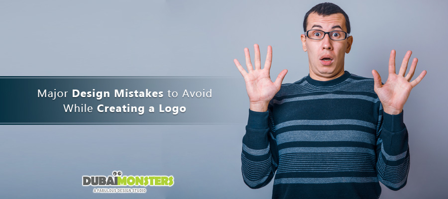
Logo is one of the many distinctive features of a brand that becomes its initial identity. This is one of the reasons why brands invest a lot on getting their logo designs right.

Many, however, end up spending a million only to be criticized later. Take Pepsi for example, spent $1 million and got criticism for causing obesity.

There are a lot of unforeseen logo design warnings just like that coming our way, every day. Some of them are so major that ignoring them can actually cause a lawsuit, for instance creating a logo similar to your competitor – sounds like trouble!

While a designer may get his/her money for the project and flee, you are actually the one who has to face it all. So this identifies yet another problem that merely hiring a mere skilled logo designer cannot do the job, you need to work with him/her like a team.

Below are some of the major logo design pitfalls that you can take into account as a small business in order to approve a logo that is flawless.

Keeping up with the fads

Perhaps the biggest of all the major mistakes is running after the latest design trends. Why? It is because trends come and go but your logo needs to live for an eternity (or just until the time it actually deems fit to change it). While many businesses make the mistake of running after those fads, top rated logo design companies look them up to avoid them in all.

Too abstract a logo

In an effort to run away from the ordinary, abstract logo becomes our safe haven. Mind you that abstract logos can be confusing for the audience as there is a risk of misrepresentation of the brand. There will be no use of the abstract logo if the audience is unable to identify it. So always create relevance while going abstract and don’t forget to take a second opinion.

Ignoring the Impact of Colors

Deciding on a color choice is a super easy matter. All you have to do is pick a color you like, match a contrast or two or your choice and you’re done! If you think that way, then perhaps it is time to change the perception.

Striking the right balance is important because color is important to your brand. Also, you need to keep your target audience in mind. For instance, green is a color denoting health, prosperity, love for nature, while red has an element of fortune and wealth about.

We all love The Hershey’s Company but being a top-notch brand that it was, and is, even their new logo became a center of attention to many critiques. All they ever did was made a slight color change and it gave resemblance to perhaps a chicken dung? Unless you can think of anything else.

hershey_new_logo

Ending up with a monogram

Rare is a chance that a monogram will end up being an awesome logo that stands out. A mere monogram cannot deliver credibility and the brand message effectively. So if your logo designer has been a monogram designer in the past, rethink your options.

Also, if you are to shorten your logo, perhaps it’s too early to do that. Establish as a renowned brand first and then go about it, like KFC and IBM. Take your time in merely flaunting those initials in a logo and design something creative reflecting your values and goals.

Expecting the logo to communicate it all

You can never expect a logo to communicate all the brand values, your mission and objectives in one place. Recovery.org tried doing that, end up with a good logo but it is confusing to see a lot many messages in one place. Spartan Golf Club on the other hand created an eternal logo as it exhibits a golf player and helmet of a Spartan in one go – perfect logo. The message is short and delivered in a subtle way. Ensure yours is not overdone, like Recovery.org, and is delivering the only message it’s supposed to, like Spartan Golf Club.

spartan_logo

Once you locate one or more of these flaws, you know what to do: Study, apply and take corrective measures.