- Who we are
Who we are

Over 100 industry awards, accolades, and achievements showcase our quality and commitment to client success.
- Services
Services
Technologies
- On Demand App Solutions
Who we are
Trusted by 500+ active clients.
- Contact Us


 +971 4 514 4745
 +971 52 181 0546
 info@branex.ae
January 4, 2016
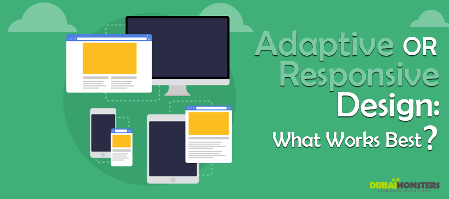
Responsive web design is like the new fad – everybody’s doing it! As the mobile web came through and became widely used, a debate on choosing...