5 Reasons Why You Need an Effective But Simple Web Design
December 31, 2015
How Different is Marketing from Branding?
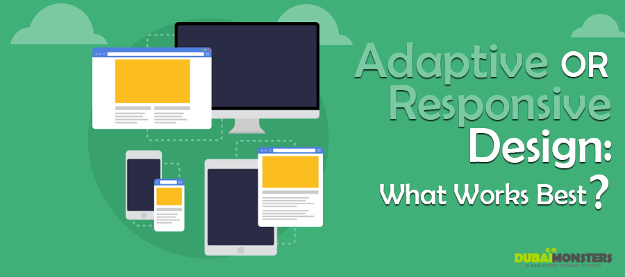
January 7, 2016Adaptive or Responsive Design: What Works Best for Designers?

Responsive web design is like the new fad – everybody’s doing it! As the mobile web came through and became widely used, a debate on choosing responsive, adaptive or standalone mobile site has started. Standalone mobile sites are not really a good idea, overall so let’s just skip them for now. The upfront and maintenance cost will have the company run out of business soon if this standalone mobile sites are chosen as a go-to option.
Table of Contents
The difference between the two
A responsive web design is quite fluid and is flexible in so many ways. It adapts well to the screen size of the target device as it uses CSS media queries.
Adaptive design, however, makes use of static layouts. They are breakpoints-based and don’t respond when loaded first time. It is usually designed for 6 common screen widths that tend to detect them gradually as they load.
Adaptive may seem like a complicated version but responsive web design is more complex as improper use of media queries can create performance issues.
When Creating Adaptive
Adaptive web design can be used for an existing site as it helps in making it more mobile friendly. Multiple, specific, viewports can be made out of this.
Apart from that, if you are looking forward to creating an adaptive site right from the beginning, media queries can be used in expanding the layout. It allows the web design to be viewed for higher resolution viewports.
To create a site that needs to be used for retrofitting, it seems like a lot of work for designing and developing a site and that too for multiple viewports.
When Creating Responsive
Perhaps the best thing about responsive designs is that even the less experienced designers and developers can create it, easily. It has been made possible due to ready-made themes via CMS systems like WordPress, Drupal and others.
The control is not as good as Adaptive but it requires minimum effort in building as well as maintaining a Responsive web design.
Since its all layouts to be designed as one, this can make the process somewhat complex. Mid-resolution is what you should aim at and then adjust it for high or low res with the help of media queries.
The BIG Decision
When making a decision as to which one to use, Adaptive or Responsive, a tip is to take your audience into account. Getting a customer insight is important for you to know what kind of devices they have got handy and will be using to access the site. Content and everything else also comes to you easily once you have collected the very insight on your target market.
Another factor to be taken into account is whether it’s a completely new thing that you are developing or simply revamping. Responsive works better when you are starting from the scratch which is why everybody is using it.
Responsive is mostly used today due to the heavy maintenance that Adaptive demands. The latter hasn’t died on us, yet, even if the world has fallen in love with the Responsive design. If there are solutions to making Adaptive web design all the more better, it eventually will become the number 1 choice as it lingers for glory.


