- Who we are
Who we are

Over 100 industry awards, accolades, and achievements showcase our quality and commitment to client success.
- Services
Services
Technologies
- On Demand App Solutions
Who we are
Trusted by 500+ active clients.
- Contact Us


 +971 4 514 4745
 +971 52 181 0546
 info@branex.ae

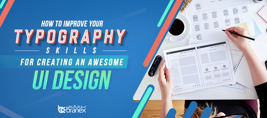
The text arrangement and the aesthetic looks of font can make or break your UI design. A great designer knows how to optimize typography to maximize readability and create a perfect graphic balance. Being a UI/UX designer, you need to keep typography in mind all the time in order to come up with a neat and clean user interface. Designers need to learn the basics of typography as it is their job to arrange information in a way that makes sense. Since most information in any website or application is text, improving your typographic skills is an important step to come up with a stellar and functional UI design.
Typography is an important design technique that can transform language into a decorative, visual element that aims at enhancing the aesthetics, and providing readers with an easily legible copy. If truth be told, copy and its appearance plays a key role in crafting an effective UI and great UX. Sadly, there are many designers who don’t focus on this important design technique which leads to design failure. If you want to create a better interface and positive UX, it is important to gain some basic knowledge of typography to present copy in a more effective manner.
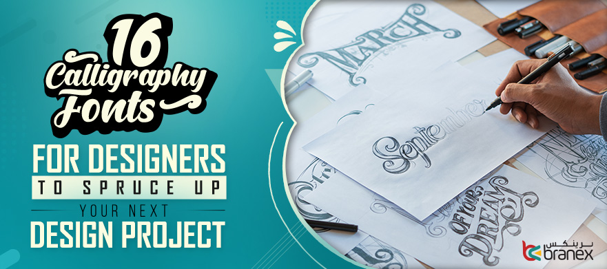
Read More: 16 Calligraphy Fonts for Designers to Spruce Up Your Next Design Project
Here are some important techniques, resources, and strategies that can help designers improve their typography skills and create an inspiring design.
Let’s delve right into them.
Make the Right Typographic Choice
In this digital world, poor user experience is not acceptable as users can easily find a better alternative. Visual appearance and readability of text in your mobile app and web design can create a major impact on user experience. If fonts are poorly selected, readers find it difficult to navigate your product or even worse they won’t bother to read your offer or use your product, which badly affection your bottom line.
To create readable and aesthetic typography, it is important to know about the different typeface styles to implement in your design project. From Open sans to Lato, Raleway to Robot, Helvetica Neue to Segoe and Google fonts, there is a number of fonts available to choose from.
Size, Weight and Height Matter Most
Once you have chosen the right typeface for your UI design, now is the time to adjust the weight and size of the fonts. The weight is basically a measurement of how thick type character is, while the size is measured in inches or pixels. The height also known as x-height is the body of every character in one size. By using these characteristics, you can easily segregate content elements such as headings, sub-headings, and body.
Scalability
Make sure the typefaces you select for your UI design should perform well across different sizes. There are many typefaces that look awesome when used with larger sizes, but some typeface with thin letterforms look good at smaller settings. Whether you are going to use a typeface for a small label, larger headlines, and text, make sure it scales accordingly to maintain readability and usability in every size.
Make Sure the Typeface is Perfectly Aligned
When it comes to creating effective typography, it is important carefully consider the alignment of the typefaces. Your text must be placed and justified into one unified composition.
Tracking and Kerning
These are the two most important processes that designers should carefully consider to come up with a UI design with perfect typography. The process of tracking allows designers to adjust space for a group of type characters that create a word. It’s a designer’s job to appropriately space for all letters to make text readable and look pleasant to the eye. While kerning allows you to adjust the space between two type characters. It works best when you want to change the spacing between two specific letters to make them feel more natural.
Typography should be Structured
Like any other design element, typography hierarchy is also important to make your design project a big hit. Organizing your content in the best way possible by using the best combinations of typefaces and fonts to make the copy easy-to-read and understandable. Make sure the headlines, subheadings, body text, call to actions, captions and other text elements are properly structured to create typography hierarchy.
Contrast
It is important to create a contrast between the prominent copy elements and ordinary text information. By simply regulating different typography elements such as fonts, sizes, typefaces, and colors, you can create a perfect contrast.
Bottom line
Hopefully, these easy and simple tips can help you improve the typographic skills that you can use to create functional and aesthetically pleasing user interface designs. With consistent studying, practice, and determination, you can also hone your typographic skills. Remember, when it comes to effective UI design, making the right typography choice is critical to provide users with a better viewing experience. By implementing these principles, you will definitely make better typographic choices for your next design project. Good luck!

