- Who we are
Who we are

Over 100 industry awards, accolades, and achievements showcase our quality and commitment to client success.
- Services
Services
Technologies
- On Demand App Solutions
Who we are
Trusted by 500+ active clients.
- Contact Us


 +971 52 936 1717
 info@branex.ae


57% of users say they won’t recommend a business with a poorly designed mobile site- Google
Think about the last time you visited a website on your phone.
Was it the layout that frustrated you or the text that was hard to read? A non-repsonsive website is most likely to compel visitors to leave the site.
That’s exactly why you need a web design that is responsive to all screen sizes.
Your website is often the first impression customers have of your brand. If it doesn’t perform well on every device.
Today, customers browse websites on smartphones while commuting or relaxing at home. They expect a seamless experience regardless of the screen they’re using. Businesses that fail to meet those expectations are most likely to fail.
Customers now expect faster, smoother, and more user-friendly websites.
The good news? Responsive web design creates a seamless user experience that provides a consistent experience everywhere.
Table of Contents
What Is Responsive Web Design?
Responsive web design is a design approach that allows a website to automatically adjust its layout, images, and content based on the size of a visitor’s screen. Instead of building separate websites for desktop and mobile users, businesses maintain a single website that works beautifully across every device.
Only a professional responsive web design agency can help you create a website that is adaptable to all screen sizes.
Let’s take a look at Branex’s website.

This responsive website can fit a 6-inch smartphone or a 27-inch desktop monitor seamlessly. You can enjoy an optimized experience without needing to pinch, zoom, or struggle with navigation.
Here’s what a responsive website achieves:
- Flexible layouts: resizable website layout that fits all screen sizes.
- Responsive images: that scale without slowing down the page.
- CSS media queries: that adjust design elements for different screen sizes.
- Mobile-first design: where websites are built with smartphone users in mind before expanding to larger screens.
Responsive websites adapt to every screen size, keeping the content aligned as per the layout.
This flexibility doesn’t just make websites look better. It creates a smoother user experience that encourages visitors to stay longer and interact with your content.
Why Responsive Web Design Matters More Than Ever
Responsive web design has been around for years, but it’s no longer simply a recommended best practice; it’s an expectation. Consumer behavior has changed dramatically, and businesses need websites that can keep up with customers’ expectations.
Mobile Browsing Has Become the Default
The days when most visitors browsed websites on desktop computers are long gone.
Mobile devices now account for nearly 64% of global website traffic, making smartphones the primary way people access the internet. Tablets add an additional share, meaning the majority of visitors are browsing on screens much smaller than traditional desktop monitors.
This shift has changed how customers are interacting
Today, people use their phones to:
- Research products while shopping in stores
- Book appointments
- Compare prices
- Read reviews
- Complete online purchases
- Contact businesses instantly
If your website isn’t optimized for mobile users, you’re creating unnecessary barriers that drive potential customers away.
It’s also worth remembering that modern users frequently switch between devices throughout the day. Someone might discover your business on social media using their phone, while others might visit your website on a laptop during lunch, and complete a purchase later from a tablet.
Responsive design ensures every interaction feels familiar and consistent irrespective of the screen size.
Google Prioritizes Mobile Experiences
Responsive design doesn’t only benefit users; it also benefits your visibility in search results.
Google now uses mobile-first indexing for ranking. It means the primary evaluation begins with the mobile version. If your mobile experience is poor, your search performance can suffer, even if your desktop website looks perfect.
Responsive websites also support better performance in areas Google values, including:
- Faster page loading speeds
- Improved usability
- Better navigation
- Reduced layout shifts
- Stronger Core Web Vitals
These factors contribute to a better overall user experience, which aligns with Google’s goal of helping searchers find websites that are easy to use.
In other words, responsive design isn’t just about aesthetics; it’s an important part of your SEO strategy.
7 Reasons Every Brand Needs a Responsive Web Design Agency
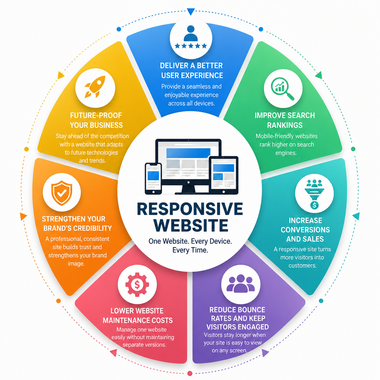
Creating a responsive website involves much more than shrinking content to fit your screen. It requires thoughtful planning, user experience expertise, technical optimization, and continuous testing across multiple devices.
Here’s why partnering with a responsive web design agency makes a measurable difference.
1. Deliver a Better User Experience
People form opinions about your website almost instantly. If visitors struggle to navigate your pages, they’ll often leave before engaging with your website.
A responsive website creates a smoother experience by offering:
- Easy-to-use navigation
- Comfortable reading without zooming
- Touch-friendly buttons
- Proper spacing between interactive elements
- Consistent layouts across all devices
When visitors can easily navigate what they are looking for, they’re far more likely to stay on your website, engage with your content, and take the next step.
A better user experience doesn’t just increase satisfaction; it builds trust in your brand.
2. Improve Search Rankings
Even the best content can struggle to rank if your website performs poorly on mobile devices.
Only a responsive web design Dubai understands how website design can influence search visibility and incorporates SEO best practices from the beginning.
Responsive websites help improve rankings by:
- Supporting Google’s mobile-first indexing
- Improving page speed
- Reducing duplicate content issues by using a single URL structure
- Enhancing Core Web Vitals
- Making websites easier for search engines to crawl
Instead of treating SEO and web design as separate projects, responsive design brings them together to create a stronger online presence.
Read more: Why custom web development is better than website templates.
3. Increase Conversions and Sales
Traffic alone doesn’t grow a business; conversions do.
Whether your goal is generating leads, selling products, or booking consultations, responsive design removes the friction that often prevents visitors from taking action.
A well-designed responsive website makes it easier for users to:
- Fill out contact forms
- Complete online purchases
- Schedule appointments
- Download resources
- Request quotes
- Call your business with a single tap
Small improvements in usability often lead to significant improvements in conversion rates because customers can complete tasks without frustration.
For many businesses, responsive design quickly pays for itself by turning more visitors into paying customers.
4. Reduce Bounce Rates and Keep Visitors Engaged
When users click a website only to find overlapping text, images spilling off the screen, and a menu that refuses to open. Most people won’t stick around to figure it out. They’ll hit the back button and visit a competitor site instead.
That’s what’s known as a bounce, and a high bounce rate often signals that your website isn’t meeting user expectations.
Responsive web design helps reduce bounce rates by creating a smooth browsing experience from the moment visitors land on your site. Instead of fighting with the interface, users can focus on what they came for.
A responsive website keeps visitors engaged by:
- Loading quickly on mobile devices
- Displaying content in a clean, readable format
- Eliminating horizontal scrolling
- Making navigation simple and intuitive
- Keeping calls-to-action visible and easy to click
The longer visitors stay on your website, the more likely they are to explore additional pages, learn about your services, and ultimately.
5. Lower Website Maintenance Costs
There was a time when businesses use to charge separately for desktop and mobile versions of their websites. While that approach worked at the time, it doubled the effort and cost required to maintain the website.
Responsive design changed everything.
Instead of maintaining multiple versions of a website, you manage one website that automatically adapts to different devices.
| Separate Mobile Website | Responsive Website |
| Two versions to manage | One website for all devices |
| Duplicate updates | Single update process |
| Higher maintenance costs | Lower ongoing costs |
| Increased risk of inconsistencies | Consistent branding everywhere |
| More development time | Faster improvements |
For growing businesses, this results in:
- Lower development expenses
- Faster content updates
- Easier website management
- Better consistency across every customer touchpoint
A responsive website is not only easier to maintain today, but it also saves time and money as your business grows.
Learn more: How a web design company is better for lead conversions.
6. Strengthen Your Brand’s Credibility
Your website often speaks before you do.
Visitors make judgments about your business within seconds, and the quality of your website plays a major role in shaping those impressions. A site that looks outdated or functions poorly on mobile devices can make even an established company appear less trustworthy.
On the other hand, a responsive, professionally designed website communicates that your business is modern, reliable, and attentive to customer needs.
It reinforces your credibility by offering:
- A polished, consistent appearance across all devices.
- Easy-to-read content that reflects professionalism.
- Smooth navigation that inspires confidence.
- Fast loading pages that respect users’ time.
Whether you’re just starting out or competing for attention with an established brand expanding your digital presence, creating a responsive design is what helps turn your visitors into loyal customers.
7. Future-Proof Your Business
Technology evolves quickly. Five years ago, few businesses considered foldable phones or ultra-wide monitors when designing websites. Today, users browse on everything from smart TVs to wearable devices.
A responsive website is built with flexibility in mind, allowing it to adapt as new devices and screen sizes emerge.
That means your website is better prepared for:
- Foldable smartphones
- Tablets in both portrait and landscape mode
- Large desktop displays
- High-resolution monitors
- Future mobile devices with new aspect ratios
Rather than redesigning your website every time technology changes, responsive design provides a foundation that grows alongside evolving user expectations.
It’s a long-term investment that keeps your business prepared for what’s next.
Want to build a website that fulfills your business goals? Get in touch today to launch a professional responsive website!
What an Unresponsive Website Is Costing Your Business
Some businesses might delay because they don’t see it as an urgent priority. The problem is that the costs of an outdated website aren’t always obvious; they build up gradually over time.
Every slow-loading page, broken layout, or frustrating mobile experience that creates an opportunity for your competitors to win potential customers.
Here’s what that can look like:
| Website Problem | Business Impact |
| Slow loading pages | Visitors abandon the website before it loads |
| Tiny buttons and text | Frustrated users leave without engaging |
| Confusing navigation | Fewer enquiries and completed purchases |
| Poor mobile experience | Higher bounce rates |
| Outdated design | Reduced trust and credibility |
| Weak mobile SEO | Lower search rankings and less organic traffic |
These issues don’t just affect user experience; they directly influence revenue.
Investing in SEO, social media campaigns, or paid advertising only to send visitors to a website that doesn’t work well on their phones can easily turn them away. Every marketing dollar becomes less effective because your website isn’t converting the traffic you’ve tried so hard for.
A responsive redesign helps protect those marketing investments by creating a better experience from the first click to the final conversion.
How a Responsive Web Design Agency Adds Value
It is easy to find ready-made or customizable templates. You can launch a website, but creating a truly responsive experience requires much more than choosing a template.
A professional responsive web design agency looks beyond appearance and focuses on how your website performs.
Their expertise typically includes:
-
User Experience (UX) Strategy
Before designing anything, agencies study how visitors interact with your website. They identify pain points, simplify navigation, and create journeys that encourage users to take action.
-
Responsive Interface Design
Designers carefully arrange layouts, typography, and images so they remain visually appealing across every screen size without sacrificing usability.
-
Performance Optimization
Fast websites create a more interactive environment for visitors. It can help them stay longer on your website, resulting in easy conversions. Agencies optimize:
- Images
- Code
- Fonts
- Scripts
- Caching
To reduce loading times and improve the overall performance of your website.
-
Technical SEO
Responsive websites support stronger technical SEO. It helps create a more secure website, resulting in better ranking. Here’s how technical SEO can improve performance.
- Clean website architecture
- Optimized page structure
- Mobile-friendly layouts
- Better crawlability
- Improved Core Web Vitals
Drive More Leads with Our Responsive Web Design
-
Cross-Device Testing
A website shouldn’t only work on a desktop, but it should be tested on multiple screen sizes for better analysis.
Professional agencies test websites across multiple:
- Smartphones
- Tablets
- Browsers
- Operating systems
- Screen resolutions
This ensures every visitor gets the perfect layout irrespective of the screen size.
-
Ongoing Support
Websites require regular updates as technology evolves. Many agencies continue monitoring performance, applying security updates, and recommending improvements long after launch.
Instead of simply building a website, they help businesses create a digital asset that continues delivering value over time.
How to Choose the Right Responsive Web Design Agency
Not every agency offers the same level of expertise. Choosing the right partner can make the difference between a website that simply looks good and one that consistently generates results.
When evaluating agencies, consider the following pointers:
- Review their portfolio. Look for websites that perform well across desktop, tablet, and mobile devices.
- Ask about their design process. Agencies should follow a mobile-first approach rather than treating mobile optimization as an afterthought.
- Evaluate their SEO knowledge. Responsive design and search performance should go hand in hand.
- Discuss performance optimization. Fast loading speeds should be part of every project.
- Check client reviews and testimonials. Positive feedback often reveals how agencies communicate and support clients after launch.
- Understand what’s included. Ongoing maintenance, updates, analytics, and technical support can provide long-term value.
The right agency won’t just redesign your website; they’ll help create a better digital experience that supports your business goals.
FAQs
What does a responsive web design agency do?
A responsive web design agency creates websites that automatically adapt to different screen sizes and devices. Beyond design, they focus on user experience, performance optimization, technical SEO, accessibility, and cross-device testing to ensure your website delivers a seamless experience for every visitor.
Why is responsive web design important for SEO?
Google uses mobile-first indexing, meaning it primarily evaluates the mobile version of your website when determining search rankings. A responsive website improves usability, page speed, and Core Web Vitals, all of which contribute to stronger search performance.
Can an existing website be made responsive?
Yes. In many cases, an existing website can be redesigned using responsive design principles without rebuilding everything from scratch. However, older websites with outdated code or infrastructure may benefit more from a complete redesign.
How long does a responsive website redesign take?
The timeline depends on the size and complexity of the project. A simple business website may take 4–6 weeks, while larger corporate or ecommerce websites can take 8–16 weeks or longer.
In a Nutshell
Your website isn’t just an online presence; it’s often the first interaction people have with your business.
And in a world where customers constantly switch between smartphones, tablets, laptops, and desktops, they expect every interaction to be seamless.
That’s exactly what responsive web design delivers.
A responsive website does more than adjust to different screen sizes. It creates a better experience for your visitors, supports stronger search rankings, improves page speed, increases conversions, and reinforces your brand’s credibility.