


Quick Answer: The Superman logo first appeared in 1938 and has been updated more than 25 times. Through every change, it kept its core: a bold red and yellow “S” inside a shield. The lesson for businesses is to evolve your logo carefully while protecting the elements people already recognise.
If you’re as old as I am, you might have heard this voice like a thousand times on your television set in your childhood.
Superman was my first childhood superhero that gave hope in tough times. I was fascinated by his powers.
How can someone be so powerful?
The ability to fly at lightning speeds, eyes that shoot a laser that cuts through anything and the strength of a thousand locomotives that can beat anyone in the universe.
If you’ve started following Superman comics or movies in the past 30 years you might be surprised to see the first Superman identity that appeared in the comics.
This is how it all started in 1938.
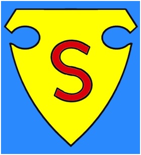
Shocking, right?
Since then the logo has been updated more than 25 times in its nearly 90-year history to match the tastes and design language of the era. However, all the changes were mostly stylistic and did not impact the visual metaphor of the logo. Despite all the iterations, the Superman emblem has always remained the same: the letter “S” inside a shield.
Key Takeaways
- Strong logos evolve without losing their identity.
- A consistent shape builds instant recognition.
- Colour creates recall; Superman’s red and yellow are part of the brand.
- Fonts and lettering should reflect your brand’s personality.
- A careful refresh is usually safer than a full redesign.
Table of Contents
What Can We Learn From the Superman Logo?
Although Superman logo received scores of facial uplifts– the letter “S” enclosed in a shield has always been there from the first logo till the last.
Why?
It’s Superman’s identity.
The “S” in the shield has been registered in the minds of the audience. Overhauling it would be the end of Superman. The character might become far more exciting and superior, but he won’t be Superman.
That’s why whenever you hire a professional logo design agency to craft a logo for your brand, it’s necessary to see whether they will be able to align your brand values consistently.
Let’s talk about the transformation Superman’s logo went through.
Superman’s symbol is a reminder that iconic logos are planned, not lucky. The same thinking guided the famous logo designers behind IBM, Apple and Nike.
The Grand Change in the Superman Logo
There were four iterations between 1938 – 1940, but the first significant change in Superman logo was made in the year 1941 when the colors were switched. The inner shield went jet black, and the border of the shield was made yellow.
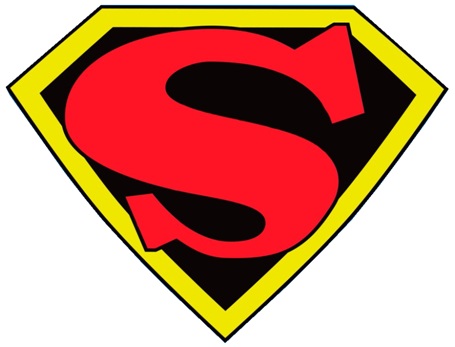
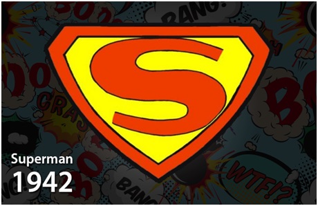
It was an abrupt change, so Superman fans didn’t fully accept the change with open arms. They started hating it. Which is why the logo was reverted to its original color the next year.
What Can We Learn From These Changes?
As designers, you have to come to term with the fact that your work will receive criticism. There might be times when you burn the candle at both ends, but still, your client will not be happy. And this will frustrate you.
Let me tell you this. To succeed as a designer, you must understand the needs of your client. Set up a meeting and brainstorm ideas, concepts and ask them what they are looking for in the finished logo?
Now, let us examine the individual elements of the Superman logo.
“A logo doesn’t sell, it identifies.”
— Paul Rand
Shape
The first superman logo was encapsulated in a police shield. However, in the year 1940, the shape was changed to a diamond. Maintaining the letter “S” at the center of the Superman symbol. Throughout the ‘40s, apart from some minor changes in the shape, the diamond shape was retained.
What Can We Learn From the Shape?
Since diamond shape was working well, no one thought of changing or replacing it all.
Also, that is what you need to do as a designer. Project after project, some things might turn out to be good for you – retain those things. For instance, if you’re facing issues with the design brief, make a template that covers all the necessary elements and uses that with a little iteration with every other client.
There is no harm in using what is working for you. If the website design is enticing users, it’s not necessary to change it or redesign your marketing collateral or website. I am telling you this because one of my friends is a fanatic when it comes to website design. Out of nowhere, he plans and redesigns his website. I am still unable to understand why he does that.
Color
Since it’s inception, Superman was seen in the same old clothes with Red and Yellow. The Superman logo went back and forth between Red on Yellow and Yellow on Red. The first diamond shape introduced a Red outline around the letter “S” with a Black diamond outline along with Yellow color. (Check the Grand Change subhead).
In 1948 the logo was changed with Black “S” with a white background. In 1996 the Superman emblem was iterated to Red on Black. Despite these occasional deviations, the logo always returns to its classic color scheme.
What Can We Learn From the Colors?
Not everything will work all the time. It is okay to shovel the old concepts in the ground.
One concept might work with one client but not with others. If you’ve developed some theories, it is necessary that you upgrade those concepts from time to time. There is no room for slow-moving designers. Either grow your skills or stay in your cocoon for the rest of your life.
Want a Logo With Superhero Recall?
Branex’s logo designers in Dubai create bold, flexible logos that can grow and evolve with your brand.
Fonts
The “S” symbol in the logo has no specific font. The style changed depending upon who drew the Superman logo. At times, it was rounded, other times it looked like a figure 8, and sometimes it is an angular slash of three lines.
What Can We Learn From the Fonts?
Just stick to 1-2 fonts in your website. If you use more fonts, it will confuse the audience.
Inspiration
The colors of the logo were kept simple because Red and Yellow colors were easy to print in old printing presses, and the colors suited the personality of the Superman character. The creators used the letter ‘S’ which symbolize his name and diamond is the representation of his impenetrable skin.
What Can We Learn From Its Inspiration?
Inspiration can come from anywhere. Keep a notebook with you at all times. Whenever you feel something is worth jotting down, note it down. Try to merge more than one ideas and see what you can come up with
Want to see how today’s brands apply these lessons? Check out the latest logo design trends for 2027.
Superman Logo Trivia
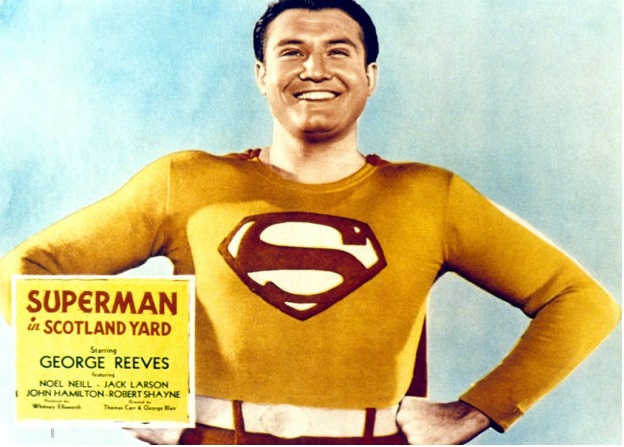
- ★The first Superman logo appeared in a serial that ran for a short time in the forties.
- ★Do you know that the curve in the logo depicts Superman’s muscular physique?
- ★It was the film that changed the meaning of the letter“S.” It represents Kryptonian family crest (The House of El)
Give Your Brand an Iconic Logo
Let Branex design a logo that is simple, memorable and ready to evolve for years to come.
FAQs About the Superman Logo Evolution
Bottom Line
The Superman logo is one of the most iconic and most recognizable logos that not only appears on Superman’s chest, but also shirts, hats, and household goods. The image is widespread across the globe.
At this point, the logo has become so iconic that no artist would even dream of altering anything. That’s the thing about designing. The design world is full of clichés. So if you want to come up with a truly epic design, take notes from the “What we can learn?” and go sink your teeth in your designs.