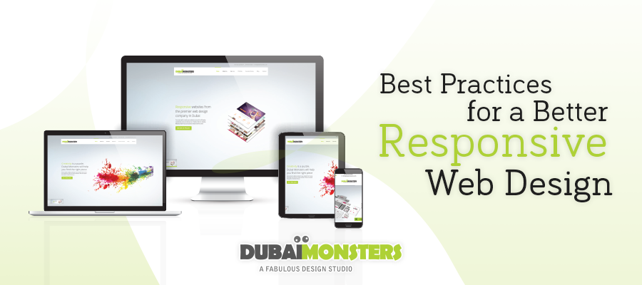
If you are looking for the most preferred and highly embraced method of website development, responsive web design is your answer. If you have a highly responsive website then chances are you can easily drive traffic your way. No more running from a non-mobile-friendly website if you give the visitors a responsive web design.
However, even with a responsive web design in place, it becomes a complex matter to keep the visitors on your page. If you don’t know how to pull off a quality responsive design then this will surely interest you. A better responsive design is what you are looking for to make all your efforts count. Ahead are some best practices for a responsive web design that actually works.
Table of Contents
Basic Function: Cross-Device Platform
Keep in mind that the basic purpose of a responsive web design is to provide a better experience to users on various mobile devices. Nonetheless, a small screen is not the only matter at hand. Remember, it needs to fit all the screens and prove to be beneficial for all. Responsive designs are directly associated with mobile screens because mobile users make up the largest percentage of the traffic. Keep a mobile-first approach and take it from there.
Beyond ‘fitting screens’: Context
When a website is converted to a mobile page, it becomes a little more than just about fitting it. Single column layout is now a span of multiple columns as and when the size increases. You wouldn’t want the layout to change really for the essence of ensuring relevance to the visitors is context. Based on the usage of different devices, the content that is most relevant should be a part of the UX decisions which may include location, past visits to the site, device, etc.
Content: Priorities!
Doing away with multiple columns to a single column layout for a smaller screen is a regular trait of the responsive site. For instance, take into notice a website that has a list of articles with featured stories on the right and images on the left of the list. When viewed over a mobile device, it may reduce to simply a list of articles hence making it easier for the viewers to view and select the articles. You need to prioritize differently for various situations.
Beware: Image Quality VS Download Speed
For websites that have images as primary visuals greeting the users, the good quality image size will make the size of the file to grow. When going responsive, you need to work out a balance between visuals and the performance of the overall page. Eliminate any rich visuals that are unnecessary or reduce the 4 images to a single image for less animation scripts as well as images. Optimize the rest of the images.
Use of Icons: A Wise Option
Icons can help replace lengthy text if need be. For small screens, where space can really be a sensitive matter, icons can play a positive role in traffic conversion. Deliver the icons to a website using the SVG file format as they are good mobile-friendly sites and can be resized, without adding a little extra to the image size.
Font Size: Pay Great Attention
Typography is amongst the fundamentals of the overall website design which cannot be ignored. The type designs need to change as well, alongside the other aspects in the overall layout. To choose the right typeface, do not rely on the one that fits well on the desktop version. What if it’s barely readable in a small device? It will certainly not be acceptable. Maintain a good line-height with the wider column with a 16pt body type to work well with all sizes.
While these may not be the end of the world or the only components to a better responsive design, you can take up on wise approach as you deem fit. Whatever you do, don’t forget to test the design on all devices, yourself!
You may not be the best judge of how you have done but the basic mistakes can be improved even before they are implemented. So test it before going live. If you are not an expert, call a web design company and a team of professionals will be at your service to do the needful.


 +971 4 2417179
 +971 52 181 0546
 info@branex.ae


1 Comment
I have been exploring for a bit for any high-quality articles
or blog posts on this kind of space . Exploring
in Yahoo I at last stumbled upon this site.
Reading this information So i am satisfied to exhibit that I have a very excellent uncanny
feeling I found out just what I needed. I such a lot indisputably will make sure to don?t overlook this site and give it a glance
regularly.