- Who we are
Who we are

Over 100 industry awards, accolades, and achievements showcase our quality and commitment to client success.
- Services
Services
Technologies
- On Demand App Solutions
Who we are
Trusted by 500+ active clients.
- Contact Us


 +971 4 247 2976
 +971 52 181 0546
 info@branex.ae

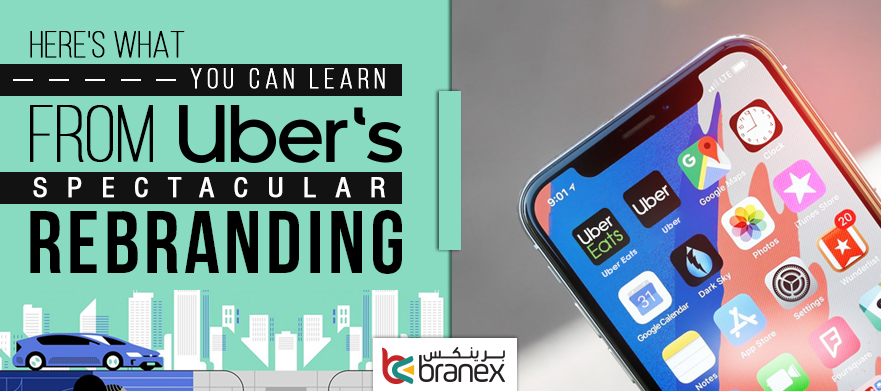
Uber Gets a New Face: Here is What you can Learn from the Spectacular Rebranding Haul
Just like people, businesses evolve. Uber, once a black car service for the few elites, has chucked its old branding for a new connected world.
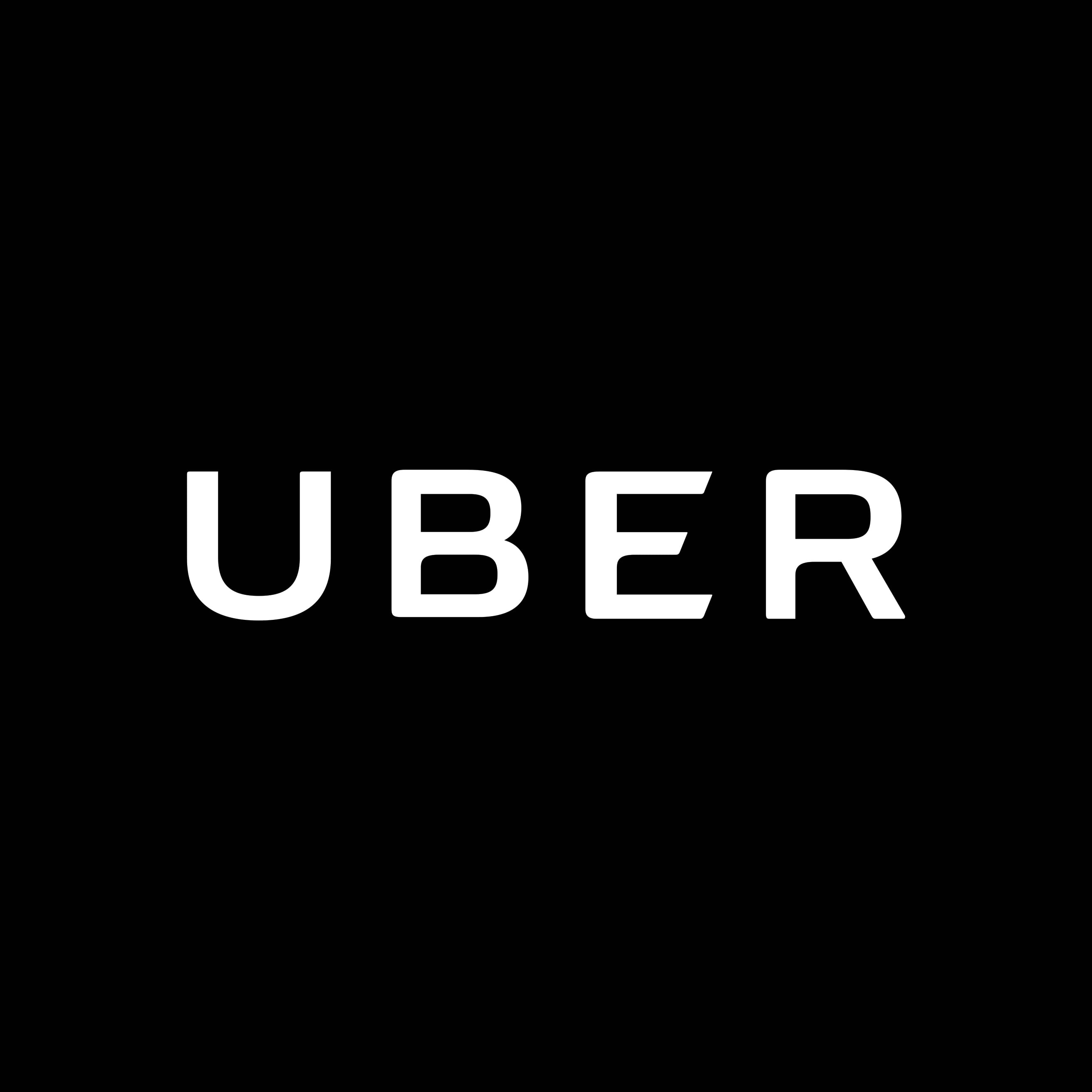
Yesterday morning, the ride-sharing app revealed its new wordmark logo. Previously, the app was recognized by its app icon. Now, the old weird logo is replaced by a crispier capital “U” with a little spacing in ‘ber’. The all-new typeface, known as Uber Move, is meticulously designed to evoke accessibility and safety–not masculine bravado.
“We’re excited to unveil a new, simplified logo for the Uber app that brings back the U, is easily recognizable, and is scalable across the 660 plus cities we serve,” expressed an Uber spokesperson in an email statement.
Table of Contents
Why the Brand Overhaul?
Uber is ushering in the new era and bidding adieu to its problematic reputation with an entirely fresh look, all set to feature a burst of vibrant hues, a custom-made typeface, and a redesigned in-app look that includes animations and so much more.
According to Uber, the icon speaks to the company’s goal of being much more than an app:
“[The atom] belied what Uber actually is—a transportation network, woven into the fabric of cities and how they move. To bring out this human side—the atoms—we’ve added color and patterns. The team has spent months researching architecture, textiles, scenery, art, fashion, people and more to come up with authentic identities for the countries where Uber operates.”
Related Read: How Much Does it Cost to Develop a Hail-a-Cab Service App like Uber
Knee-jerk reactions aside, the new brand strategy actually makes sense. From a private Hyundai black car to diversification, the company is growing at an exceptional rate; First the laundry service to food delivery, and now the helicopter service!
The previous app icon with crisscrossed lines mimicking the street grids and circuitry,`suggests that Uber is more of a transportation infrastructure than a startup.
The logo identity is tailored with respect to each country. The colors run the gamut of hues from green, red, and pink, to yellow. For instance, in India, the adopted shade is orange. This sends a signal that the company is thinking globally rather than focusing on just one region.
Just like the Cola Wars in the US, the primary focus of Uber is to build a competitive mindset on a global level.
There is more.
While using the app, you’ll find new animations, colors, and a blue safety symbol that represents safe spaces. As per Dara Khosrowshahi, the primary colors black and white are the same, but the secondary colors will see some variations, e.g. shades of orange and brown.
Lessons for Brand Managers & founders
As soon as the logo was updated, there was a response on Twitter from brand advocates.
Biz Carson in her tweet pertains to the change as, “Wow, big Uber rebrand this morning. Goodbye, weird bits and atoms logo.”
This is an age of anarchy. Any slightest change will get noted and talked about across the social media realm. Whenever you plan for a brand redesign, you need to consider all the odds. Whatever you do, create a stellar image of your brand in front of the existing and the new users.
Just changing to go with the flow is not a wise decision. For instance, when the New Coke by Coca-Cola was launched to give a hard time to Pepsi, the strategy backfired and left the loyal brand supporters of Coca-Cola agitated. A similar thing can happen if you’re going for a rebranding without first thinking of why you are rebranding in the first place?
The New Logo is More About Heart & Stories
As soon as Khosrowshahi took his place as the new CEO, his core focus centered on aligning the company culture with its brand identity. The CEO changed the logo twice and both the times, the logo reflected the company culture and brand values that the company holds dear.
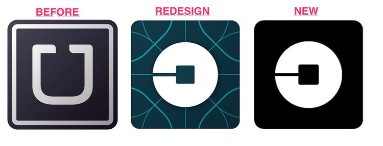
The crisscrossed logo was all about showcasing the global reach in a street grid view. While the latest app icon logo is more about simplicity and transparency.
The real challenge in building the new logo was to sustain the old brand elements and merge them seamlessly with the new ones. The company realized that people were having issues in suggesting a drop point, so Uber refined the process and made it easy. A brand with brains & creativity never ceases to impress people with its innovation.
The Bits & Atoms – The Design Elements
Before the redesign, it was assumed that the logo elements were random, but a video says otherwise. it is not about the drivers and the customers; it is about investors, Google Ventures (bits) and the private equity firm TPG Capital (atoms).
The best way to capture the hearts of your users is to engage the user with a background story. With every brand redesign, Uber released a story in tandem. To support the brand elements, the story needs to be authentic and show the culture of the company.
Related Read: Best Logo Designs that are Bound to make Heads Turn
Simplicity is Beauty in Branding
The new logo is the simplest of them all. The Uber Move, as they call it is the most readable typeface with black and white color combo. It is not just about branding for the sake of making headlines.
Good brands map out their customer experience looking for opportunities to simplify, eliminate steps, and bid adieu to confusion and complications in ways that add value. High-quality brands unearth where the brand and the experience fit in with their user’s day-to-day life, looking to make not just the experience easier, but also the user’s life.
A rebrand only makes sense when you are trying to shed a company of its less-than-stellar reputation. Worth $72 billion, Uber is the most valuable private company in the world. Dara Khosrowshahi has been the CEO for a year, and since the start, he has had his hands busy, clearing the mess created by the former CEO, Travis Kalanick. Let’s hope things get better in the future.