- Who we are
Who we are
Over 100 industry awards, accolades, and achievements showcase our quality and commitment to client success.
- Services
ServicesWeb DevelopmentBranding DesignCloud ServicesDigital MarketingSoftware DevelopmentEmerging TechnologiesTechnologies
- On Demand App Solutions
Who we are
Trusted by 500+ active clients.
- Contact Us
The Evolution of DC Comics Logo

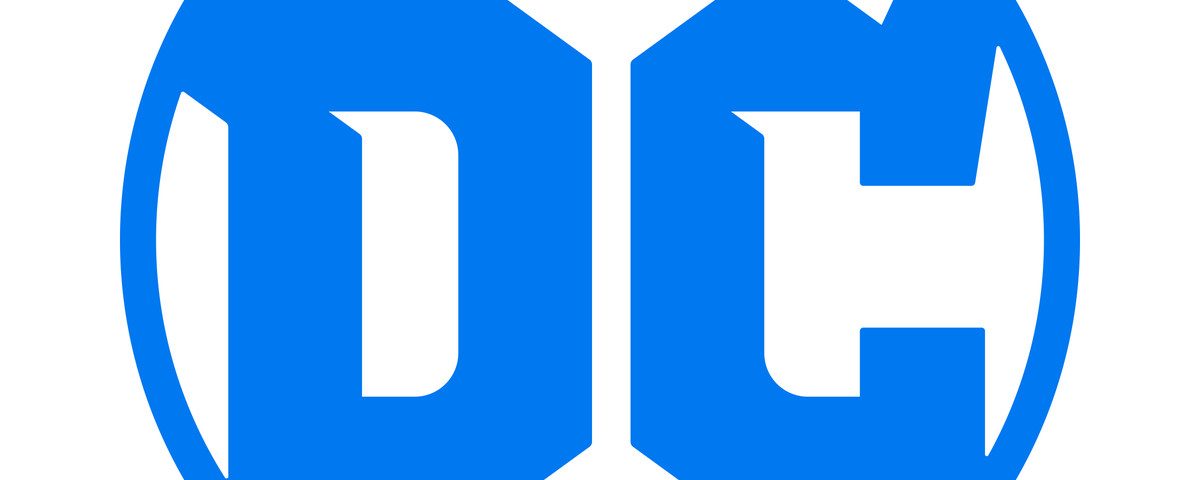
The DC Comics unveiled their new logo that is stirring in new energy into the world of fictional universes. The biggest comics publishers in the industry paid tribute to its 80-year history and it is very much influenced in their new logo design.
The logo design is classic and the fonts used are retro in bolds which makes it stand out. While it resembles to that of the DC Comics logo back in 1972, only this one looks a bit more robust, giving out a touch of contemporary prominence about it. Even though the overall design looks more old-school than modern.
Since DC Comics is home to a highly influential filmverse and larger than life fictional characters’ universe, it would be unfair to ignore its heritage. Take a look at the video below to find out how the logo has evolved over the years, beginning all the way from 1940 – and that is a very long time!
Hold your breath for here it comes… Evolution of DC Comics Logo.
Related posts
Questions? We are here to assist
Ask about Branex’s services, pricing, or anything else. Our experts are here, ready to help.
Fill up the form we will get back to you.
Who We Are
What We Do
Find Us
2602, 26th Floor, Mazaya
Business Avenue, BB2, Jumeirah Lakes Towers, Dubai, UAE
Copyright © Branex. All rights reserved


 +971 4 2417179
 +971 52 181 0546
 info@branex.ae


