- Who we are
Who we are

Over 100 industry awards, accolades, and achievements showcase our quality and commitment to client success.
- Services
Services
Technologies
- On Demand App Solutions
Who we are
Trusted by 500+ active clients.
- Contact Us


 +971 4 247 2976
 +971 52 181 0546
 info@branex.ae

Bringing traffic to your website in 2026 can be a bit of a challenge.
You may have to put in a lot of focus, energy and discipline to have a website that’s pitch perfect for customers; but the sad part is, visitors often bounce before the website even loads up.
And it hurts to see that hard work you put in going nowhere.
The average global conversion rate has reached around 2.86%, which tells us that superficial design tweaks are no longer enough to win.
What you need to do is ruthlessly eliminate the friction your end user experience.
Today, I am going to share 5 website tips & tricks o you stop losing revenue and start getting the best of results from your website traffic (which is actual conversions).
So without further ado, let’s get started.
Table of Contents
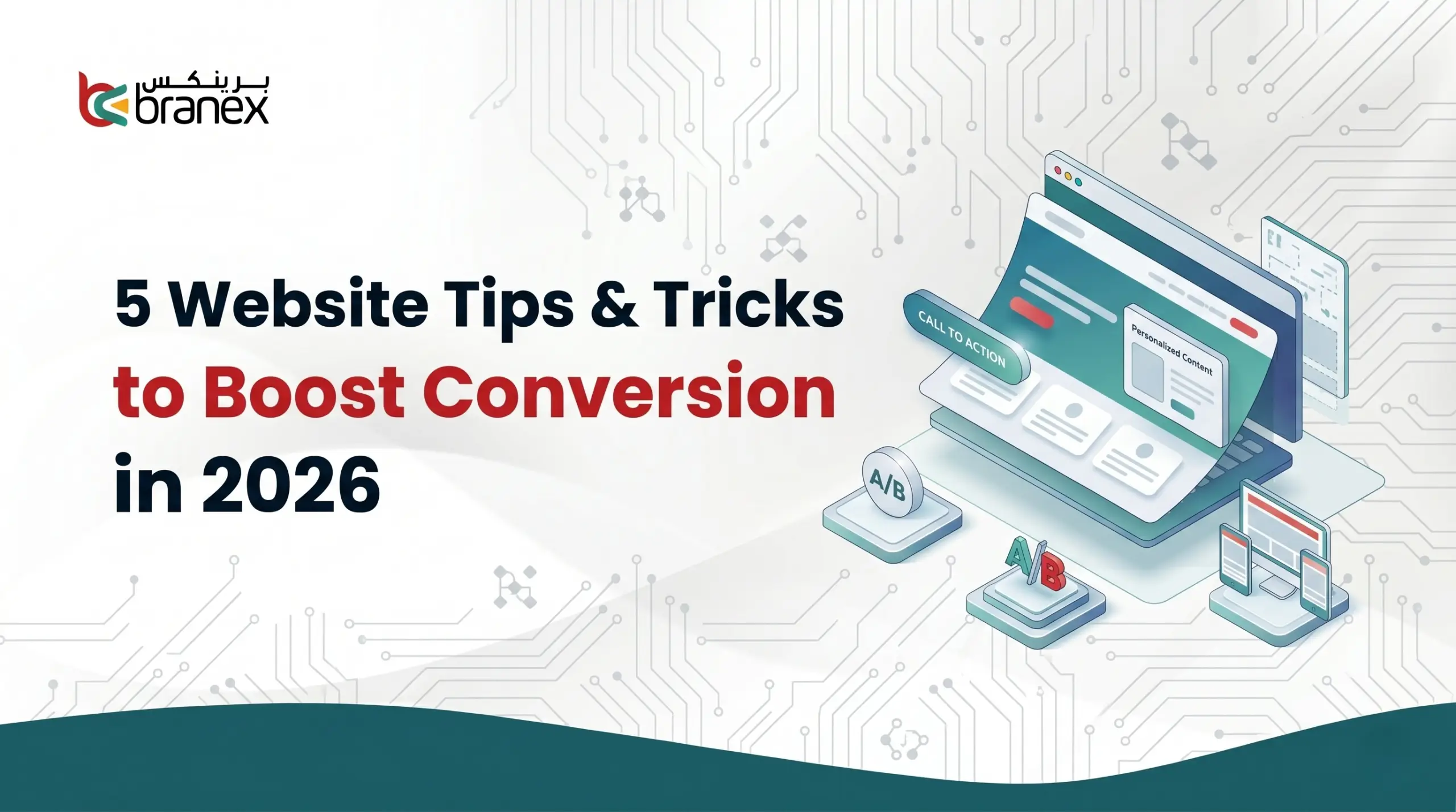
5 Website Tricks to Boost Conversion in 2026
Tip # 1 – Ditch the Carousels and Un-Hide Your Content

For years, web designers have tried to cram as much information above the fold as possible using tricks to save space.
However, modern user behavior has completely changed.
Scrolling has become as natural as breathing, while clicking requires a conscious decision. So here’s the thing, if you hide your content, it won’t get read.
Here are some essential layout fixes you need to make in order to boost website engagement.
- Kill the Homepage Carousel: Rotating sliders are great for internal politics when every department wants homepage space, but they are terrible for conversion. Data consistently shows that almost no one clicks past the first slide. Instead of hiding your core messages in a carousel, stack those sections vertically so the user absorbs them naturally as they scroll.
- Ban Accordions and Tabs: Up to 76% of website visitors scan pages. If your product features or FAQs are hidden inside clickable tabs or accordion drop-downs, you are creating a reader’s block. Try to make the text pop out so it appears directly on the page.
- Embrace the Tall Page: Don’t be afraid of long-scrolling pages. A sales page should emulate a real sales conversation, you wouldn’t just stop answering a client’s questions halfway through a pitch just to save time.
When your website has more vertical space, it means there’s more room to answer objections, build trust and add social proof.
A famous study by Crazy Egg proved this perfectly.
When they replaced a short page with one that was 20x longer to answer all user concerns, their conversion rate spiked by 30%.
It’s why Neil Patel is a staunch believer of long-form content.
Tip # 2 – Design Your Website for the Thumb-Zone

Because squished desktop sites don’t convert visitors.
If you look at your analytics, you’ll likely see a frustrating trend emerging, mobile traffic is dominating, but mobile conversions still lag far behind desktop.
The problem is almost always responsive design that simply shrinks desktop elements to fit a smaller screen, rather than redesigning them for how people actually hold their phones.
A few UI fixes can often go a long-way.
Think of your user journey first.
You don’t want to force users to scroll all the way back up a tall page to buy or subscribe. Therefore, you can simply add a stick “Add to Cart” or “Get Started” button that remains anchored to the bottom of the screen (right in the thumb-zone) as they scroll.
There is nothing more frustrating than having to pinch-zoom just to click a link or check a box. Both Google and Apple recommend a minimum tap target size of roughly 44 to 48 pixels.
Give your buttons and text links generous padding (whitespace) so users don’t accidentally click the wrong thing and abandon the page out of frustration.
In our opinion, sidebars and complex grids have no place on a mobile screen. Keep your mobile layouts strictly single-column.
When you stop making users stretch, pinch, and hunt for the next step, they are significantly more likely to take it.
Tip # 3 – Treat Speed as a Psychological Baseline

It means follow the 100 millisecond rule.
Most website owners still treat page speed as an SEO checklist item just to appease Google.
But in 2026, speed is a psychological threshold. We have reached a point where a slow website doesn’t just annoy a visitor, it also actively destroys their trust in your brand.
Think about the last time a checkout page hesitated for two seconds. Your immediate thought wasn’t “my internet is slow,” it was “is my credit card safe here?”
Did you know the e-commerce giant Amazon famously calculated that just one-tenth of a second in page delay cost them 1% in sales? For smaller businesses without Amazon’s built-in brand equity, the penalty goes even deeper. Industry data shows that every 100-millisecond delay in load time can bring your conversion rates down to 7%. It means a website that loads in 1 second converts nearly three times higher than a site that takes around 5 seconds.
You can’t afford to do a complete website overhaul, so what should you do then? Reclaim those lost milliseconds by fixing a few bottlenecks in your website.
| The Bottleneck | The Immediate Fix |
| Massive Media Files | Swap out outdated JPEGs and PNGs for next-gen formats like WebP or AVIF. They reduce file sizes by up to 30% with zero loss in visual quality. |
| Loading Everything at Once | Stop making the browser work so hard upfront. Implement aggressive lazy-loading so your site only fetches images and videos right before the user actually scrolls down to them. |
| Third-Party Script Bloat | Audit your tracking tags. Defer non-critical JavaScript (like heatmaps or heavy customer service chat widgets) until after the core text and images have fully rendered. |
When your site loads instantly, it feels professional.
Speed can often remove that slight friction between a user’s impulse and their action.
And you certainly do want to cash that now, don’t you?
Tip # 4 – Redesign Checkouts to Eliminate Surprise Anxiety

easy checkout process
Let’s just zoom out for a second, put yourself in your customer’s shoes.
Just imagine, you spend a good ten minutes browsing an eCommerce website. You finally pick the item you want to purchase and enthusiastically click the checkout button on the product.
Then, right when you’re about to reach your wallet, the page automatically reloads to reveal there is an additional $15 shipping fee, a surcharge and some taxes you need to pay.
What happens next? The excitement instantly turns into frustration. You close the tab. It’s what we marketers term as surprise anxiety, and it’s the single biggest conversion killer in e-commerce.
In fact, research shows that nearly 48% of all cart abandonments happen simply because extra costs were hidden until the final step.
If you’re running an eCommerce store and you don’t want your customers to backout, you need to establish upfront transparency.
If shipping isn’t free, do not make your customers wait until step three of the checkout process to reveal to them the final price.
Display estimated shipping costs and taxes directly on the product page, or at the very least, inside the slide-out cart.
When the price they see on the product page matches the price on the final receipt, they will find you a more trustworthy source.
Make the checkout form as short as possible. Nobody wants to fill a 23 point form during an eCommerce checkout, so cut down unnecessary info requirements such as “Company Name” or a secondary phone number.
Keep the autofill feature on so mobile users don’t have to type in a lot of details. Speaking of typing long details, people often despise typing out 16 digit credit card numbers especially on their phones.
Give them the option of digital wallets like Apple Pay and Google Pay, along with Buy Now, Pay Later (BNPL) options.
When they have other express routes, you allow them to bypass your carefully designed forms entirely.
Believe it or not, but that is a massive win for your eCommerce conversion rate.
Tip # 5 – Move Social Proof from Passive to Active Reassurance

In an era where anyone can generate a hundred fake reviews with a single AI prompt, modern consumers are highly skeptical.
Slapping a generic quote that says, “Great product!” – John D. at the very bottom of your homepage is basically invisible.
Passive social proof is now dead.
If you want to boost conversions in 2026, your social proof needs to be active. It must act as a specific counter-argument to a buyer’s hesitation, placed exactly where they experience the most friction.
Stop banishing your best reviews to a dedicated “Testimonials” page. It’s a place where almost no one visits.
Instead, try this. Drop micro-copy, trust badges, or your strongest one-line review directly underneath your highest-friction elements.
It can be pricing tables, or the final “Subscribe” button.
These micro-elements can build the perfect psychological safety net right when they are hesitating.
When there are vague praises on your website, they certainly do not convert. You need quantifiable outcomes, so swap out “highly recommended” ones to display live stats like “142 professionals downloaded this today” or measurable outcomes like “Cut our reporting time by 4 hours a week” gives your claims undeniable weight.
When you place the right proof at the exact right moment, you stop hoping for them to believe in you and start proving that others already do.
Key Takeaways
- Carousels and hidden tabs kill engagement. Stack your content vertically and let users scroll naturally, scrolling is a reflex; clicking is a decision.
- Stop shrinking desktop sites. Anchor your primary CTAs to the bottom of the mobile screen and use large, 44-pixel tap targets to prevent frustrating misclicks.
- Every 100-millisecond delay can drop conversions by 7%. Compress images (use WebP/AVIF) and delay heavy scripts so your site feels instantaneous.
- “Surprise” shipping costs cause 48% of abandoned carts. State all costs upfront, cut form fields in half, and prioritize one-tap options like Apple Pay.
- Burying generic testimonials at the bottom of the page no longer works. Place data-backed reviews directly next to your “Buy” buttons to counter hesitation at the exact moment of friction.
Is Friction Silently Killing Your Conversions?
Driving traffic to your website is only getting more expensive and competitive as the digital world is changing.
If you’re still relying on cosmetic redesigns or outdated assumptions to convert those hard-earned visitors, you are leaving revenue on the table.
A high conversion website isn’t just about making your website look pretty, it’s more about developing a discipline of eliminating friction.
We are not saying you need to rebuild your entire website overnight.
Optimization is momentum. It builds gradually.
Do you want us to audit your website this week for any of the five mentioned friction points above, and make the required fixes? Let us help you turn your website into an immediate win.