According to Seth Godin, “A brand is the set of expectations, memories, stories, and relationships that when taken together, account for a consumer’s decision to choose one product or service over another.”
But a question remains: how does your brand represent such non-tangible ideas and how do you foster customer interest towards your brand? The answer is simple… through your visual brand identity design. Your marketing collateral is, in essence, any visual or media used to promote your brand and communicate your services and products in a more effective manner. It can be anything from a letterhead to a business card or a brochure to an envelope or a storefront window.
Scrutinizing McDonald’s, Nike, Samsung, Coca-Cola or any other global giant, you will surely find quality and consistency in brand identity design in every campaign. If truth be told, the success of your brand comes down to how effectively you communicate what you have to offer. Your brand identity collateral is a creative and unique way of narrating your business story so that your customers can readily comprehend who you are, what you do, and what you have to offer.
Your brand identity design truly embodies what your brand is all about, and serves to portray your business in a more professional and reliable light. Failure to do so results in negative repercussions and a host of missed opportunities. Each marketing collateral should have a consistent look and feel while serving to solicit the attention of your audience.
Here is an easy and effective guide to creating a stunning brand identity design for your company that leaves a lasting impression.
Table of Contents
Go for Geometric Graphics
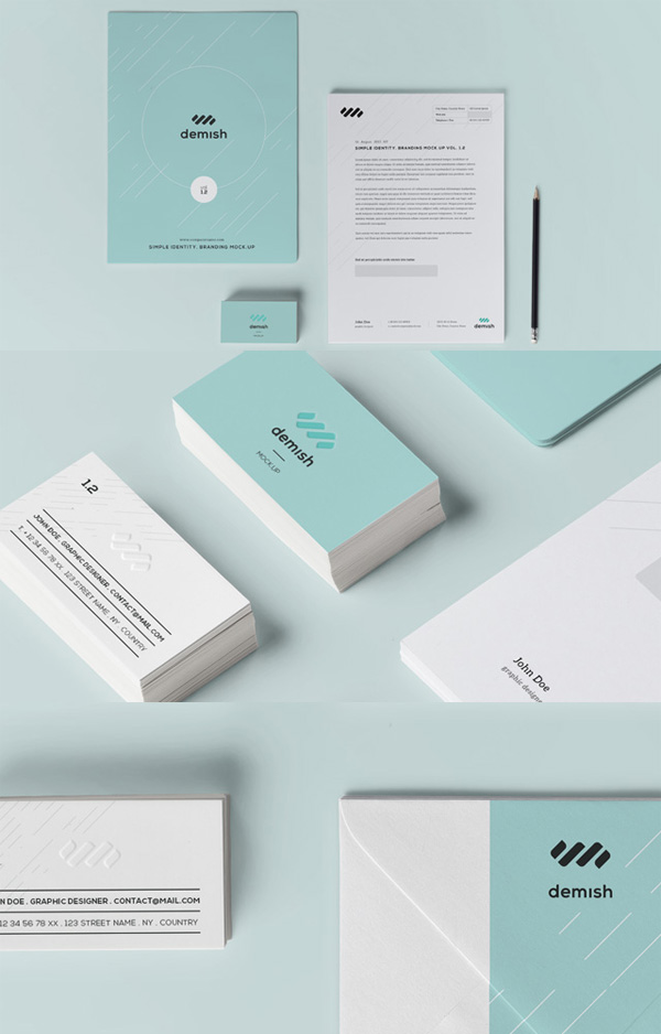
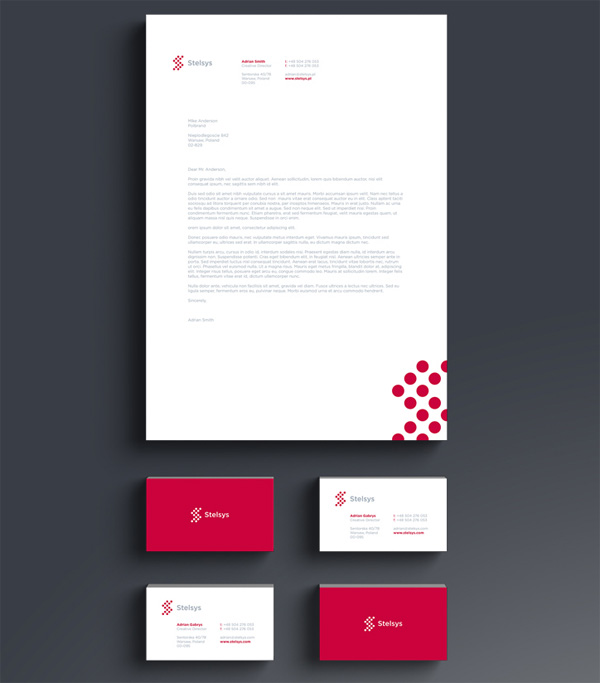
Why not boost your branding buck by scaling up a design element of your logo or some other recognizable graphic, which can be turned into an abstract artistic element or a pattern. Believe it or not, such geometric vectors are a unique way to enhance the style factor of your brand collateral – be it a business card, letterhead, or brochure. It can infuse your visual identity designs with that oomph factor. Not to mention, geometric shapes look incredibly effective, are easier to design, and versatile enough to repeat across your entire branding collateral. Once you have the primary stylistic elements of your letterhead in place, such as your logo, brand color, pattern, and graphics, these elements can be repeated across all your branding materials.
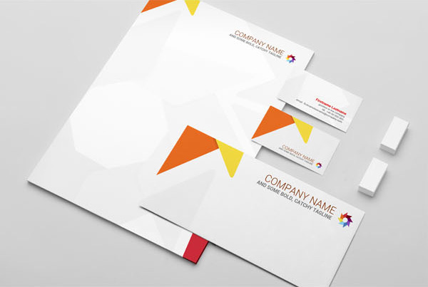
You can take inspiration from this strikingly designed brand collateral, and apply the geometric style to your stationery, business cards, envelopes, merchandise, or letterheads. This design builds up repetitive triangles to create a logo like design in a punchy and playful color palate and repeats it across corners of each branding medium. Adding geometric shapes to your marketing collateral is a sensible yet creative way to incorporate colors and a subtle style to the backdrop of your design.
Opt for a Monochrome Pattern
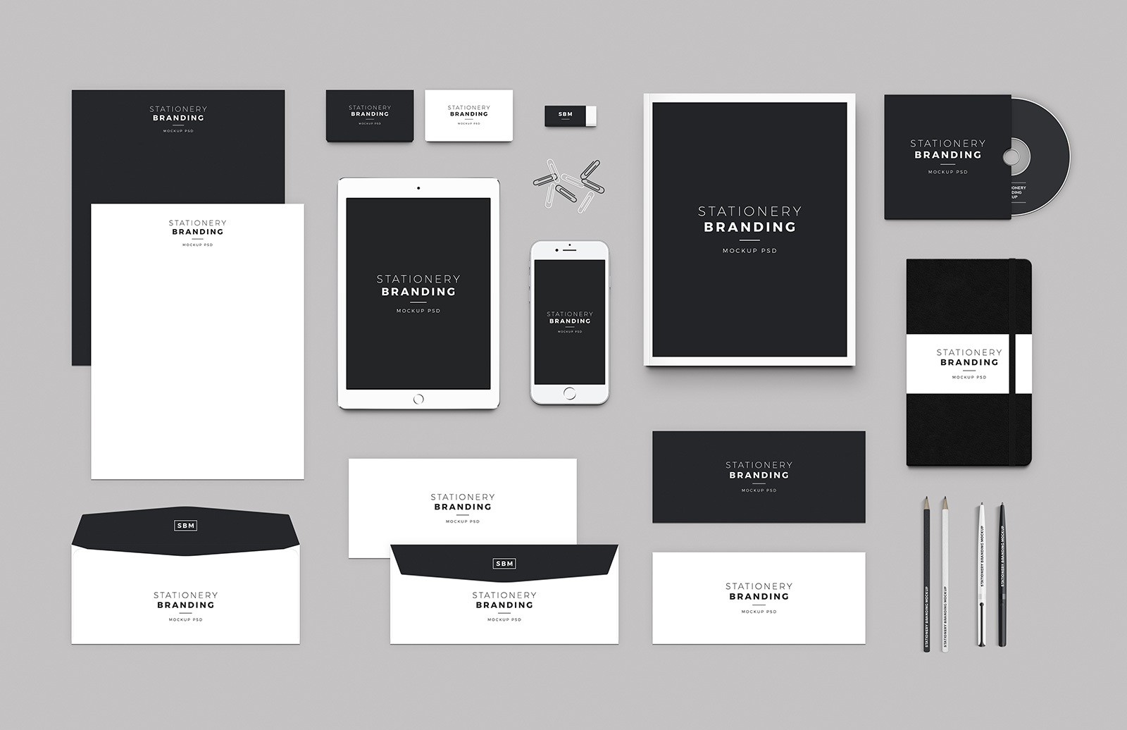
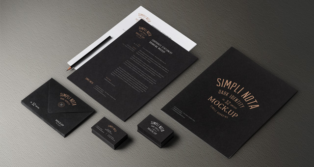
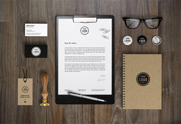
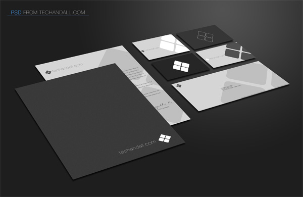
Designing your promotional materials in a monochromatic theme works equally as well as vibrant splashes of colors. Keep in mind that not all monochromatic palettes feature hues of a single shade; some dark palettes are an amalgamation of black and gray hues, touched up with occasional tinges of blue. You can go for a monochrome palette if you want to achieve a simple, yet a professional and an absolutely fantastic look. Have a look at this black and white color palette that gives this brand collateral a distinctive feel.
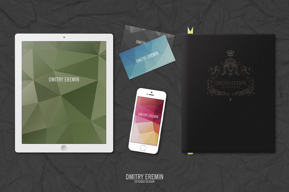
A dark palette also gives your visual identity a modern and sleek feel.
Remember to complement a dark monochrome with a lighter hue to make sure your content is easily legible and understandable. Such monochromatic color palettes make your designs timeless and chic.
Create Something Pleasingly Tactile
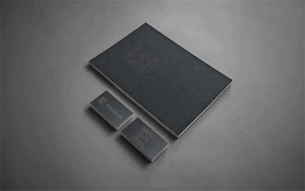
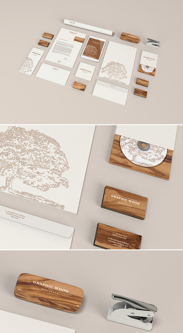
If you really want your letterhead to make an impact, find access to a printer that can accommodate some special and mindboggling printing effects. For instance, you can add a rich, textured surface to your letterheads, business cards, and other promotional materials to make them visually appealing and tactile. Special finishes include metallic inks, spot-UV, and foil blocking, amongst others. While your cost may slide towards the pricier end of the spectrum, they offer a unique opportunity to make your branding collateral more memorable, visually impressive, and tactile.
You can also get your feet wet in embossing, which helps to create a 3D raised effect, which adds style and elegance to your designs. Afterall, we have scientific evidence to back up the fact that engaging more than one sense of the user can boost the recall of a branding material!
Even if you cannot afford to infuse your branding material with special effects, you can always add an illusion of texture to make your designs stand out.
Keep the Design Simple
One of the most important factors behind every effective design is simplicity. Your marketing collaterals are designed to deliver your brand story and elucidate the products and services that you offer. Therefore, it is important that your letterhead, business card, brochure, flyer and other identity designs feel great in hand and showcase the content that you want your audience to read in the most positive light. This can only happen when you focus incorporating simplicity in your design.
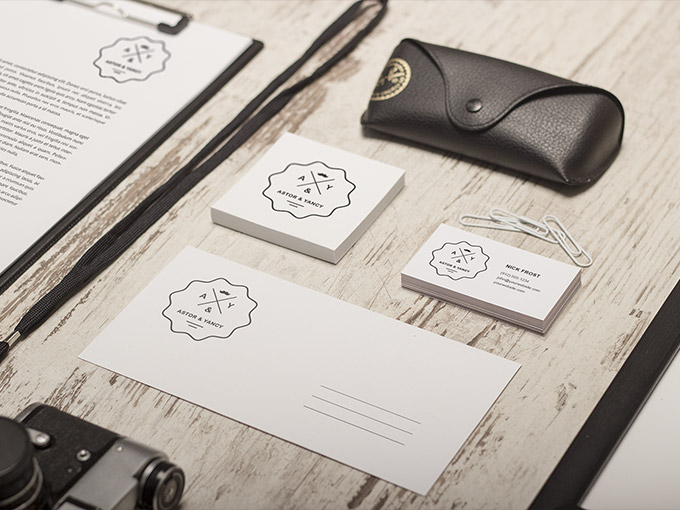
Have a look at this minimal, elegant and simple design.
You can achieve a strong, formal and appropriate look with the help of simplicity in your design. You can make use of white spaces to visually declutter your identity designs.
If you limit your design to a few key elements such as one color, one logo, and a simple trim, you can easily attain a simple yet professional and clean look.
Use Some Essential Brand Elements
If you have a unique corporate brand identity and color scheme, you can repeat them across your branding materials to make them unique, consistent, and effective. Make sure that you represent your brand by using your brand logo, color scheme, typography and imagery across all mediums.
Maximize your Logo
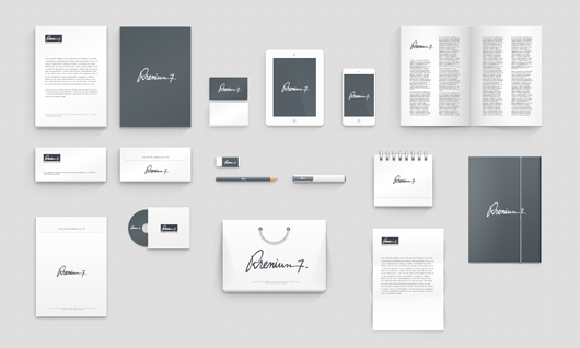
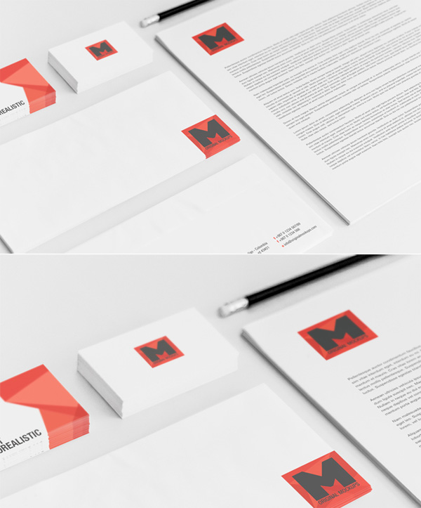
Your brand recognition is dependent on how many people see your brand logo, however, it’s a double-edged sword since you can end up overdoing it as well. For instance, the template below strikes a fine balance by leveraging the logo as a decorative element in the top corner of the letterhead, while amping it up as the major and the only design element across all other mediums.
Or this design, that incorporates the logo in all their branding materials, while giving it a different and creative treatment in each.
Use Watermarks
If you are worried that adding borders or corner design elements will make your branding materials look cluttered, leaving not enough room for text, a watermark is an amazing solution to incorporate graphics and color without sacrificing space.
For instance, this template lifts the logo shape while toning down the shade to make it appear subdued and blend in the background. They have aced their watermark to perfection; it’s not too dark as to subdue text and not too light as to lose impact.
Add Border to Standout
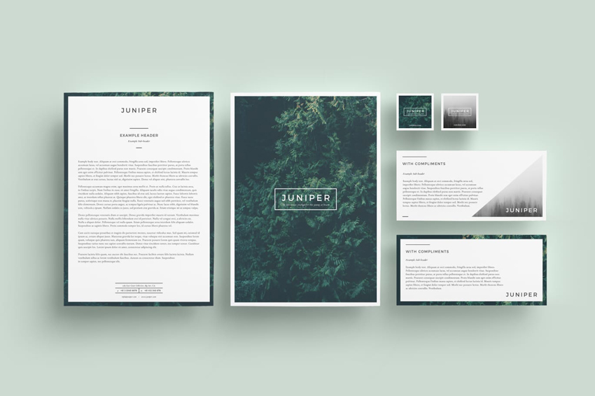
You can capture user attention by incorporating some creative and elegant elements without distracting your audience from the actual message that you want to convey. Adding a border to your corporate brand identity design is a great idea to help readers focus on the content while creating a long-lasting impact. Not to mention, a border can tie your design together with a neat bow.
To Conclude It All
To create a design that stands out, you need to differentiate your brand from others. You can create whole stationery sets by simply incorporating any of these above-mentioned ideas and take your visual brand identity to a whole new level. Investing a lot of time and efforts into designing your corporate brand identity design can set your brand apart from your competitors. You can simply choose ready-to-edit branding and identity templates like we have shown, or hire a design agency worth its salt to create one that immediately reels in your users without much ado.


 +971 4 2417179
 +971 52 181 0546
 info@branex.ae

