- Who we are
Who we are

Over 100 industry awards, accolades, and achievements showcase our quality and commitment to client success.

- Services
Services
Technologies

- On Demand App Solutions
Who we are
Trusted by 500+ active clients.

- Contact Us

 +971 52 905 2719
 info@branex.ae

Graphic design trends in UAE is no longer simply about creating something visually attractive; it is more about designing for a highly connected, multilingual, and culturally diverse audience.
At the end of 2025, the UAE had 11.3 million internet users, with internet penetration at 99%, while social-media user identities reached 12.5 million.
This level of digital adoption tells brands increasingly need visual identities that work across websites, social platforms, mobile screens, digital advertising, physical spaces, and video, not just traditional print.
At the same time, UAE audiences expect brands to communicate naturally within a market shaped by Arabic culture, international businesses, and a highly multicultural population. The result is a transition from rigid, one-size-fits-all corporate templates toward flexible brand systems that are more Arabic-aware, culturally accurate, responsive, and motion-ready. In 2026, the strongest graphic design approaches are not simply following global trends; they are more focused towards the UAE’s unique visual and cultural environment. Let’s take a closer look at the design practices shaping 2026.
1. Arabic-First Brand Design
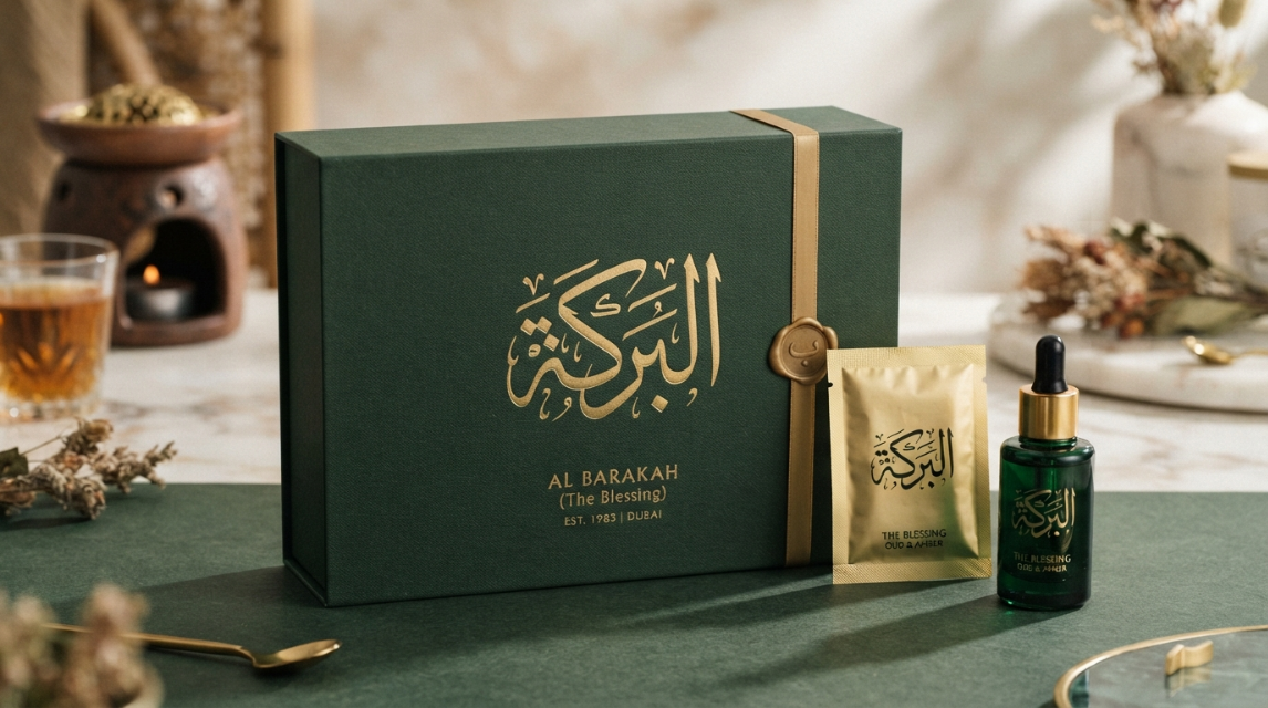
Arabic-first branding dominates the UAE market in 2026.
Agencies no longer create an English identity and translate it into Arabic as an afterthought. Brands develop Arabic and English together as part of one visual system.
In many cases, the Arabic version receives primary placement.
Designers treat Arabic wordmarks with the same care as English logos. They use Arabic typography as a visual graphic element rather than just supporting text.
The following approach requires harmonized Arabic and Latin typefaces. It also demands correct right-to-left layouts across websites, packaging, and social media.
Today, many government organizations, banks, real estate developers, and retail businesses rely heavily on this method. Somewhere, a brand might use a custom Arabic wordmark as the main logo while fitting the English name around its proportions. And in UAE, it’s pretty common for brands to use Arabic & English as two expressions of the same brand. Designing for both languages means testing Arabic line wrapping, numerals, mobile layouts, and call-to-action button placements separately.
2. Refined Neo-Minimalism
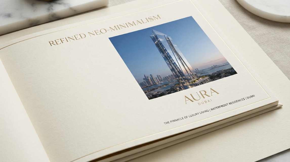
Minimalism remains popular among most UAE brands.
The current iteration is a luxurious form known as neo-minimalism. This style uses very few visual elements but focuses intensely on spacing, typography, and material quality.
Many luxury hotels, premium real estate developers, and financial firms favor this aesthetic.
They use generous white space and limited color palettes. Large typography takes center stage alongside high-quality photography.Instead of simply decorating a page, neo-minimalist design communicates quality through restraint. A luxury property brochure might feature a cream background, a single elegant serif typeface, one architectural photograph, and a subtle gold foil accent.
3. Motion Branding and Kinetic Identities
Static logos fall flat in digital-first markets like Dubai and Abu Dhabi. Brands now build motion systems that define how their icons, patterns, and typography behave on screens.
Agencies produce animated logos for mobile apps and interactive website elements. They create kinetic typography for digital billboards and social media posts. A proper kinetic identity defines consistent motion principles. These rules cover animation speed, transition style, and movement direction.
A fintech company might use fast horizontal motion to represent quick transactions. A real estate brand might use slow, steady transitions to project stability. Designers use tools like After Effects, Lottie, and Rive to create lightweight animations that load quickly on mobile devices.
4. AI-Assisted Graphic Design
Artificial intelligence operates as a standard tool in the UAE design workflow. Designers do not use AI to replace their work. They use it to explore ideas, generate visual variations, and automate repetitive formatting tasks. Agencies prompt AI to create early mood boards and produce background textures. They use it to generate initial packaging concepts and test different color combinations.
AI still has strict limitations. Generated visuals often appear generic or culturally inaccurate. The software frequently produces incorrect Arabic text and distorted human features.
However, a final brand identity still requires strategic thinking, cultural understanding, and professional trademark evaluation from an experienced designer.
5. Bold, Expressive Typography
At Branex, we believe typography operates as a primary brand asset. Today, many UAE brands use giant headlines, custom lettering, and unusual proportions to grab attention.
It’s a graphic design trend in 2026 which is commonly adapted and applied by designers. They apply bold condensed fonts, high-contrast layouts, outdoor advertising and social media campaigns.
In fact, designers often pair contemporary Arabic sans serif fonts with clean Latin sans serif fonts. A luxury Arabic typeface eventually pairs perfectly with a refined Latin serif.
Using a default Arabic system font next to a carefully selected English typeface ruins a brand’s credibility. Both languages must share the exact same visual weight and personality.
6. Regionally Inspired Minimalism
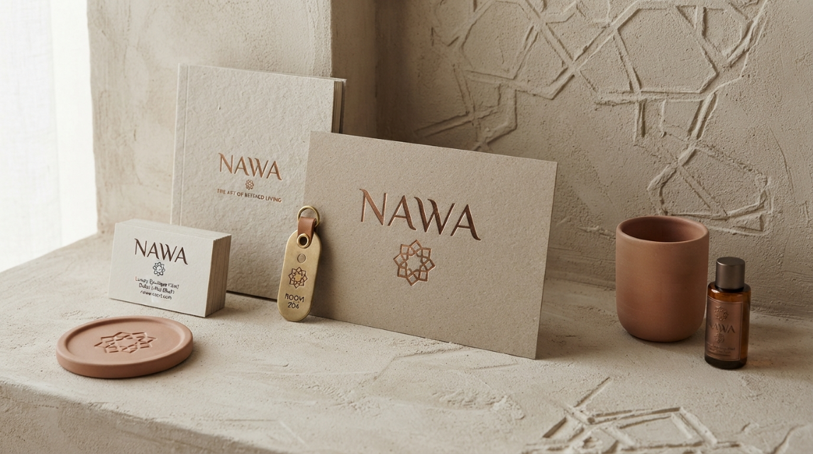
Many UAE brands nowadays, mix modern layouts with subtle references to Gulf culture and architecture. It’s a practice where they use obvious symbols like generic camels or predictable desert imagery.
Designers usually build color palettes using soft sand, terracotta, deep green, and bronze tones. They further incorporate geometric patterns based on Islamic architecture.
Background textures replicate stone, plaster, or woven materials showing the richness of religious generosity and cultural integrity embedded through and through in their very lives.
The standalone specific approach gives a brand an internationally competitive outlook, yet at the same time maintain a deep-seated connection with the UAE.
7. Culturally Inclusive Imagery
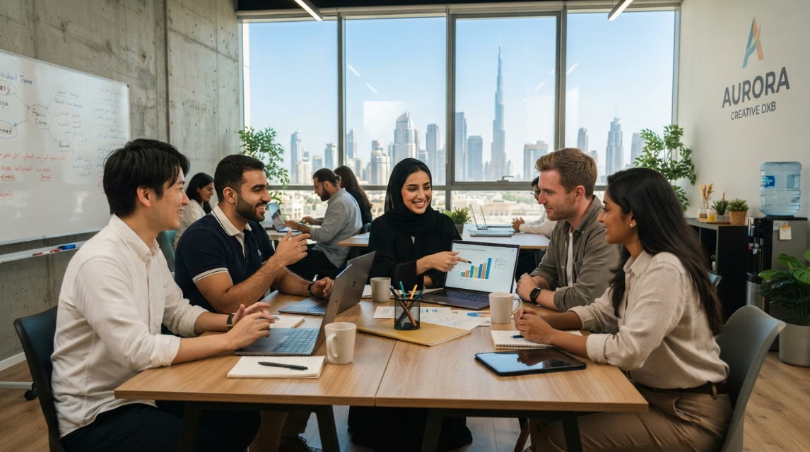
The UAE population is highly diverse.
Therefore, the graphic design trend they favor in 2026 reflects this multicultural reality quite deeply. Brands often reject narrow or stereotypical representation in their photography.
Campaigns feature people from varied cultural backgrounds in realistic UAE environments. Photographers capture diverse age groups and natural interactions.
Businesses audit their imagery for cultural accuracy before launching campaigns. They check color meanings, clothing styles, and religious references to ensure the photography matches the actual communities they serve.
8. Human-Centred and Authentic Design
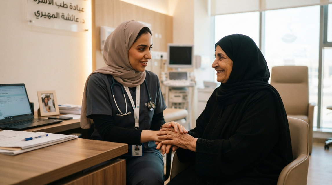
Audiences prefer visuals that feel real and emotionally engaging.
This way, brands spend less time on highly polished, artificial digital imagery.
They use behind-the-scenes photography and feature real employees in their marketing materials. For example, a clinic uses documentary-style imagery of actual doctors treating patients. A technology company shows how a real business uses its software instead of relying on abstract 3D renders.
Natural imperfections build trust.
This style works perfectly for schools, law firms, and business-to-business companies.
9. 3D Graphics and Dimensional Visuals
Three-dimensional design appears predominantly across UAE advertising, virtual showrooms and product presentations. In fact, many real estate developers and automotive brands use 3D graphics to assist customers experience a product lifecycle before they step ahead and make a purchase.
Current 3D work avoids the hyper-realistic style of past years. In fact, today many designers prefer stylized materials, soft lighting, and unusual perspectives. They build interactive property tours and digital exhibition environments that users can easily navigate on their phones.
10. Immersive and Interactive Design
Graphic design expands beyond static posters. Interactive design lets audiences participate in the experience. Agencies build scroll-based website graphics and augmented reality product previews. They design QR-enabled packaging that launches interactive brand videos. Tourism and retail sectors use adaptive interfaces where colors and layouts respond to user behavior or the time of day.
11. Sustainable Visual Design
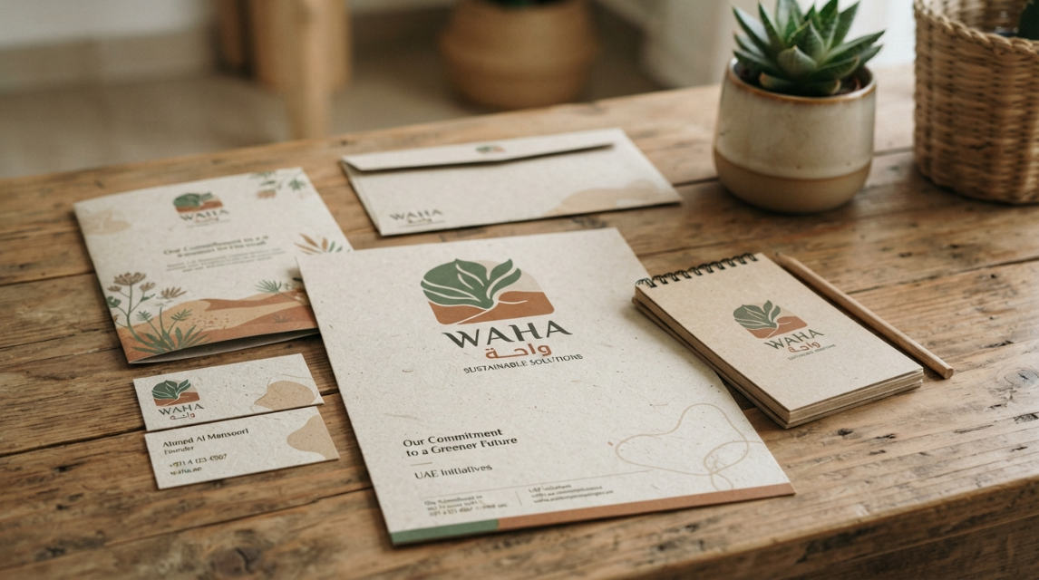
Environmental considerations influence the physical production of branded materials. Brands print on recycled or FSC-certified paper. They use uncoated finishes and fewer ink colors.
The visual style often features earth tones, organic shapes, and less glossy presentations. Companies must support this aesthetic with actual business practices. Adopting a natural look without actual sustainable practices immediately looks like greenwashing.
12. Flexible and Adaptive Brand Systems
UAE businesses communicate across WhatsApp, massive outdoor billboards, printed brochures, and social media. One rigid logo cannot fit all these spaces. As a matter of fact, brands normally build flexible identity systems. A modern brand manual includes responsive logos, compact mobile marks, and modular graphic patterns. A full horizontal logo sits on a building exterior, while a simplified icon fits into an Instagram profile picture.
13. Premium Metallics and Material-Led Design
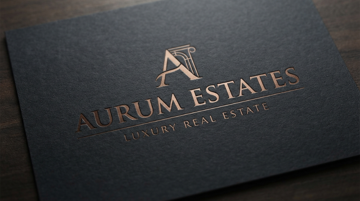
Luxury sectors continue to use gold, bronze, marble, and brushed metal textures. Real estate, high-end retail, and hospitality brands rely on these material references.
Designers apply these effects with extreme restraint. They use a dark charcoal background with a single, thin bronze line and an embossed logo. This creates a stronger perception of luxury than covering an entire layout in shiny gold gradients.
14. Organic Imperfection and Visible Craft
There’s a common trend where designers are often motivated to add handmade qualities to polished brand systems. They incorporate hand-drawn illustrations, textured brushwork, and collage-inspired compositions. This design approach is often found in cafes, boutique hotels, and cultural institutions using irregular shapes and paper grain textures. Altogether, it makes a business appear more personal & approachable rather than just a cold corporate vibe sending a strong professional exuberance.
15. Retro-Futurism
Retro-futurism mixes nostalgic visual references with futuristic themes. Designers draw inspiration from 1990s technology, arcade graphics, and early digital interfaces.
Technology events, gaming tournaments, and youth-focused products use this specific style. It works perfectly for an innovation program but fails completely if applied to a conservative government service or traditional bank.
16. Personalised and Data-Driven Visuals
Brands connect customer data to their graphic output. They produce customized landing page graphics and audience-specific social media ads.
A Dubai real estate company might run three different visual variations of the same campaign. They show architectural details to investors, parks to families, and premium materials to luxury buyers. The core brand identity remains exactly the same across all versions.
17. Stronger Ramadan and National Occasion Branding
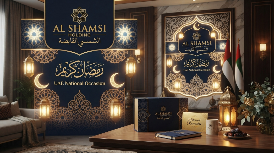
Seasonal design requires thoughtful cultural expression. Brands adapt their existing identity for Ramadan, Eid, and UAE National Day.
Successful companies introduce lantern-inspired geometry, warm lighting, or calligraphic details while preserving their standard colors and fonts. Native Arabic-speaking professionals must review all seasonal copy, religious references, and imagery for accuracy.
18. High-Contrast Colour Palettes
High-contrast colors improve visibility on digital screens. Many designers balance bold accents with controlled typography and ample whitespace.
These combinations grab attention quickly in social media feeds and outdoor advertising.
Frequently Asked Questions (FAQs)
How can we make our English and Arabic logos look cohesive?
Your English and Arabic logos do not need to look identical, but they should carry similar visual weight. Match factors such as stroke thickness, overall height, spacing, and level of formality rather than simply choosing two fonts that look similar. If the Arabic version appears darker, wider, or more decorative, adjust its weight or customize the lettering instead of shrinking it to compensate. Always test both versions in black and white and at actual signage or digital sizes to ensure neither language dominates visually.
Should we use AI to design our company logo?
AI can be useful for exploring concepts, styles, and mood-board directions, but the final logo should be professionally designed and converted into clean, scalable vector artwork. AI-generated graphics may contain unsuitable or overly generic elements and should not automatically be assumed to be unique or legally protectable. A designer can refine the concept, create consistent Arabic and English versions, prepare production-ready files, and ensure the identity works across signage, print, packaging, websites, and social media.
How can we create Ramadan branding without making it look cliché?
Instead of replacing your existing identity with generic crescents, lanterns, or mosque illustrations, build Ramadan elements into your established brand language. Keep your core colors and typography, then introduce seasonal touches through warmer photography, subtle geometric patterns, refined Arabic typography, or changes in lighting and composition. The campaign should still be recognizable as your brand even when the obvious Ramadan elements are removed, which helps maintain consistency while giving the campaign a seasonal feel.
Does our business really need an animated logo?
An animated logo is most useful when your brand regularly appears in videos, social media, digital advertising, websites, presentations, or digital displays. If your business mainly relies on physical signage, stationery, packaging, or other static applications, a strong static logo should remain the priority. Before investing in animation, identify where it will actually be used and create a short, simple motion version that supports those applications rather than treating animation as an essential upgrade.
Why does our Arabic website layout look wrong even after translation?
Arabic content needs more than translation because it follows a right-to-left reading direction that can affect navigation, alignment, spacing, buttons, icons, menus, and overall visual hierarchy. Rather than placing Arabic text into an English layout, review the entire interface as an RTL experience and test it on both desktop and mobile. Pay particular attention to mixed Arabic-English content, numbers, forms, and navigation, and have a native Arabic reader review the final design for awkward spacing or unnatural reading flow.