- Who we are
Who we are

Over 100 industry awards, accolades, and achievements showcase our quality and commitment to client success.
- Services
Services
Technologies
- On Demand App Solutions
Who we are
Trusted by 500+ active clients.
- Contact Us


 +971 4 247 2976
 +971 52 181 0546
 info@branex.ae

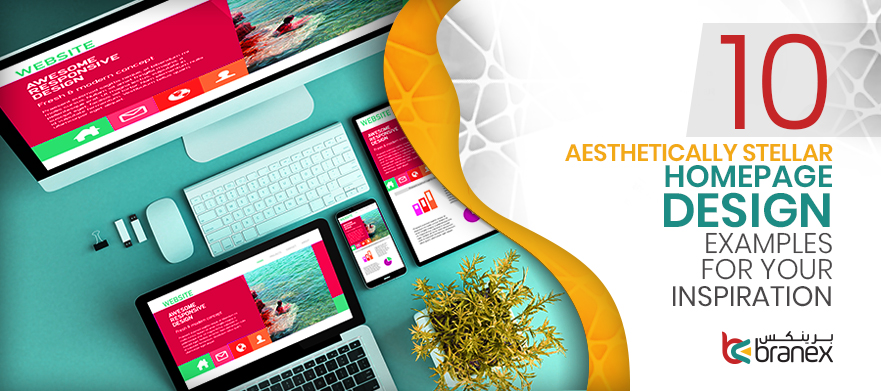
10 Aesthetically Stellar Homepage Design Examples for Your Inspiration
Your website’s home page is the first thing people see when they land on your website. You have only a few seconds to wow them with beautiful imagery, engaging content and persuasive CTAs. Every marketer wants to create a stellar homepage design that converts, as an awful design prevents prospective buyers from taking the intended action. Remember, people won’t convert if you don’t provide them a neat, clean and intuitive design. This is why it is critically important to win the trust of your customers by understanding the essential design elements that must be incorporated into your website.
Related Read: 5 Leading Web Design Trends for 2019
If you are thinking to update your homepage design in 2019 that will best work for your audience and business both, here are some out-of-the-box homepage design examples that help you come up with a better version of your website
Let’s get started.
1. HubSpot
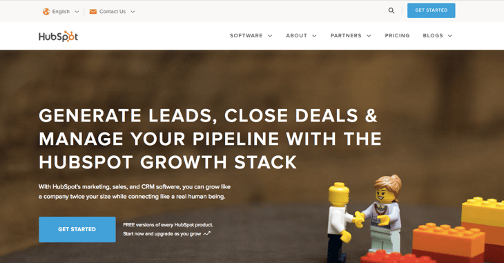
When you land on HubSpot’s website, the LEGO characters immediately catch your attention that is strategically placed to convey the message of the brand. They use highly-convincing CTA button “Get Started“ to encourage users to try their free version. The blue and orange color scheme draws your attention to CTAs and links, guiding users what they are supposed to do.
2. Dropbox
Dropbox is a creative homepage design example that is using hero image to catch the attention of users. The brand knows well how to attract their audience and solve their pain points in terms of security and efficiency. Engaging and catchy CTAs with dark background draw more attention of the users while giving users with an easy and simple navigation.
3. Airbnb
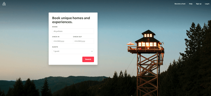
Airbnb is one of the awesome homepage examples that is guiding its users what to do when they land on their website. The homepage includes destination and date search form to guide visitors to the logical next step. The search form is intelligent enough and autofills the details of already logged in users. They smartly use the background color of CTA “Search” that makes it stand out from the rest. Airbnb users are provided with suggestions for gateways and trips and shows which of these sites are most popular among users.
4. Slack
The homepage design of Slack consists of unique illustrations and elegant graphics. The tagline “where work happens” says it all and clearly tells the purpose of their product. Users can sign in or create an account, thus Slack’s homepage makes it clear what visitors are supposed to do.
5. Mint
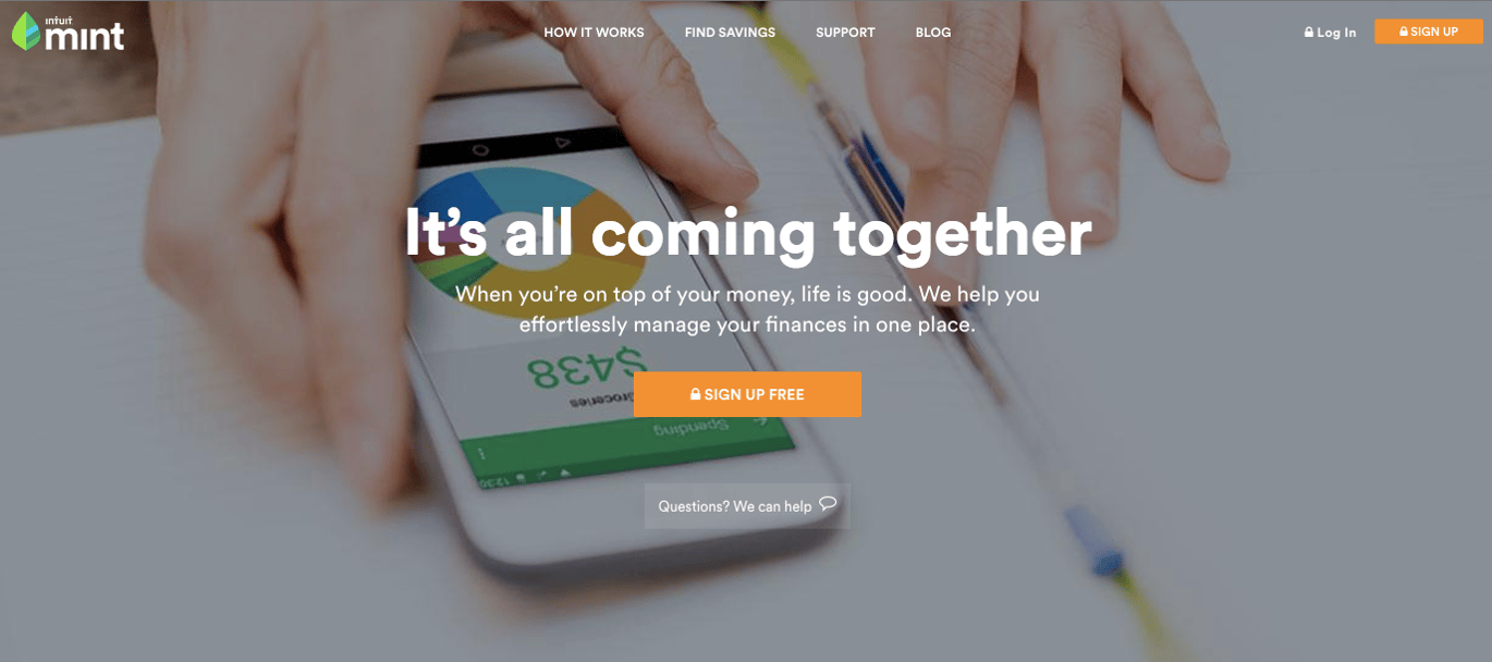
Mint focuses on simple and clean design, strong headline and subtle aesthetics which create a unique style and personality of a brand. The homepage contains a simple, persuasive CTA copy “Sign up Free” which encourages users to take the action. The design of a CTA button is exquisite that has a secured lock icon that creates a sense of safety among its users.
6. Crazy Egg
The homepage design of Crazy Egg focuses is designed to encourage visitors to enter their website URL to view a heatmap. Another option of the 30-day free trial is also available for users along with the option of “Cancel anytime”. They intelligently use social proof to inform their visitors that a large userbase trusts their tool for increasing website conversion.
7. Skype

Skype’s homepage design is tailormade for its intended audience that works perfectly well on all device types and the headline shows that they have a strong user base who trusts their service. They mention three things people can use Skype for – Talk, Chat, Collaborate. The CTA button with blue background and white text stands out on the page and catches users’ attention.
8. Chipotle
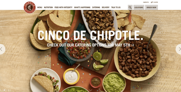
Another great homepage design example that cleverly uses the forthcoming holiday as their unique value proposition, getting users to start clicking through the site. They used visually-alluring and tempting food photography to make users hungry.
9. Ahrefs
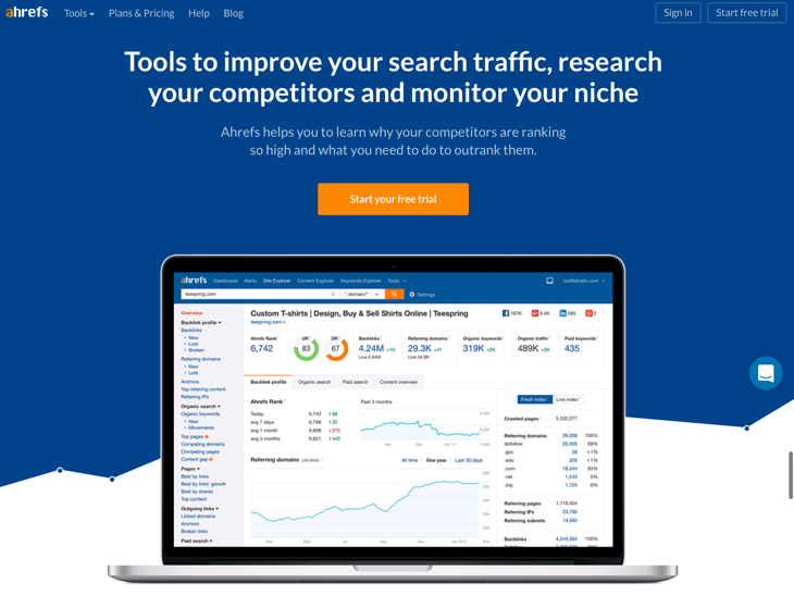
Ahrefs effectively used the attention-grabbing color contrast of blue, white and orange color that makes the headline and CTA stand out on the page. The CTA button and subheading creates a beautiful combination that persuades users to start tracking and outranking competitors for free. The homepage offers multiple options for the users, the smart use of solid background and clean typography makes the design clutter-free and simply awesome.
10. Branex
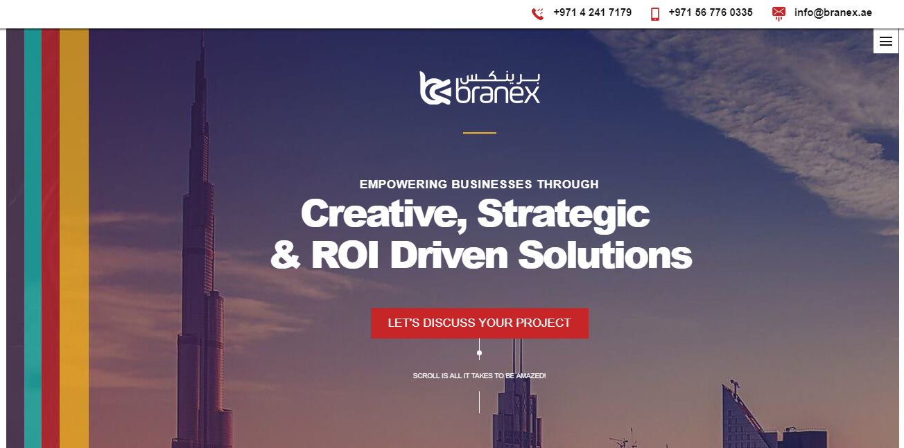 The website’s homepage focuses on the solutions the brand provides to its clients. They intelligently used a slider option to explain to their audience what they do. The solid color of a CTA button encourages users to click the button that takes them to contact us form.
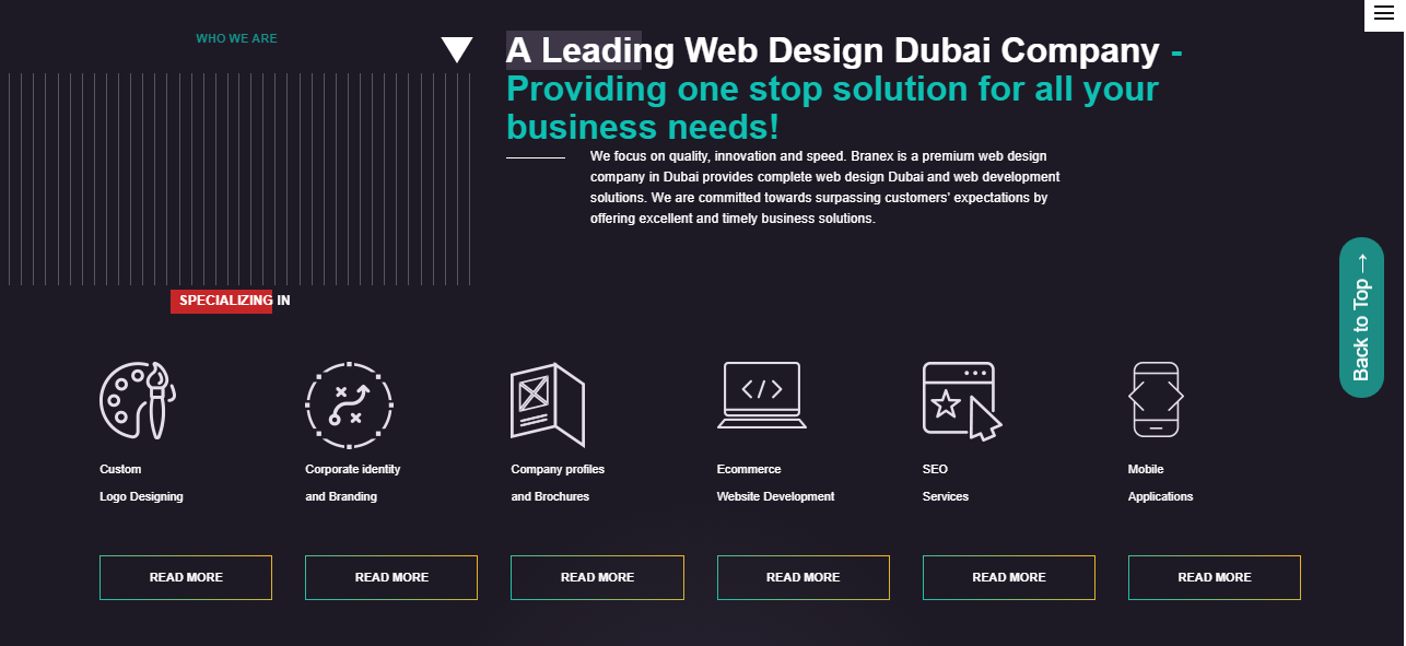
If you scroll down, you will find all the services that company offers, an explainer video that tells how the brand can solve your pain points, and case studies that will definitely win prospective clients’ trust. Furthermore, the color scheme and clean aesthetics create a great sense of sophistication and elegance.
In Closing
Keep in mind you never get a second chance to create a first impression on your website visitors. Improve your homepage design by keeping the above-cited awesome examples in mind, or simply contact Branex – a professional web design and development agency in Dubai that will transform your existing design into an effective one.
