A recent study by Google suggested that an average user has about 36 mobile apps installed on their smart phones and the usage is only limited to 9 of them. Statistically revealing, only 4% of the installed apps are used on daily basis by an average American mobile phone user.
So, what factor is that which makes the mobile app usable? Its user engagement.
User engagement in mobile app design accounts for the user experience design (UX) principles that are used to your advantage. Any app that is being used more by the user in comparison to others is definitely more usable and ranks high in terms of user experience. A more usable app is not only high on user experience but it also reduces chances of app uninstalls. Better user experience also accounts for your app getting a positive word of mouth, something that is beyond and above all kinds of app marketing practices that you follow digitally.
Let us now look at 5 ingredients that you put in to create epic mobile app designs that will delight your users globally:
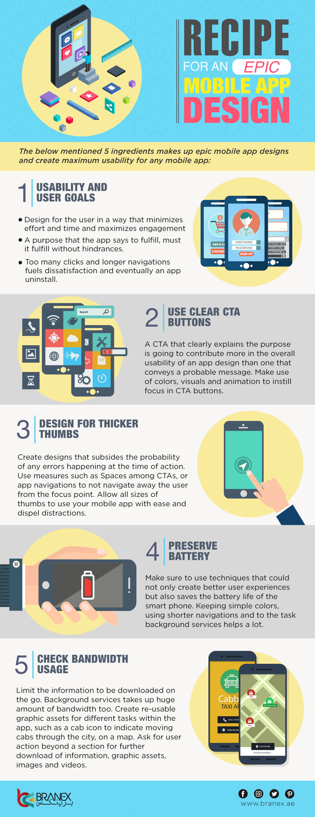
Usability and user goals
Supposed you own a cab company and you have designed an app for the users to use and call a cab. Imagine a user stranded at a bus station in heavy rain. What possible requirement your user will be hoping to be fulfilled at that time? Calling a cab with minimal efforts. And this is exactly you would must design your app for. Create a UX flow that allow your users to fulfill their requirement in minimal time with minimal efforts. Too many clicks, longer wait will eventually result in your app uninstalled.
Define clear call-to-action (CTA) buttons
Call-to-action buttons, commonly known as the CTA button is to induce the user to take the action desired by the app owner. Referring to the previous example of a cab company, a probable CTA for them would be ‘Book a cab’. A CTA that clearly explains the purpose is going to contribute more in the overall usability of an app design than one that just said ‘submit’.
Secondly, a CTA button should almost always be very visible to the app user. Naturally that requires it to be placed somewhere where the user will focus or you use techniques upon the button to design it in a way that builds the focus on it. Use of colors, visuals and animation are the widely used ways to instill focus in CTA buttons.
Do not design for thinner thumbs
And by that we meant to say that place the CTA at considerable distance from each other (in case there are more than one) and avoid linking them to shapes that are small, like a dot. Imagine you have two dots signifying two different purposes, and your user has a thick thumb. Chances of errors rise automatically in such cases and out of frustration your user might just click, Uninstall!
Related: https://www.branex.ae/blog/mobile-design-trends-for-2017/
Do not drain the battery
Mobile app design of any app should be created by focusing on the battery usage. For example, use of multiple colors of animations could result in faster drainage of battery. Therefore, while designing your mobile app, make sure to use techniques that could not only create better user experiences but also saves the battery life of the smart phone. Keeping simple colors, using shorter navigations and to the task background services helps a lot.
Focus on bandwidth usage
Another preventive measure in a mobile user experience that should be avoided is high bandwidth consumption. Limit the information to be downloaded on the go. Background services takes up huge amount of bandwidth too. Create re-usable graphic assets for different tasks within the app, such as a cab icon to indicate moving cabs through the city, on a map. Ask for user action beyond a section for further download of information, graphic assets, images and videos.
Let us now look at a graphical depiction of what we read here, for better understanding and retention purposes.
Embed Code:


 +971 4 2417179
 +971 52 181 0546
 info@branex.ae


