- Who we are
Who we are

Over 100 industry awards, accolades, and achievements showcase our quality and commitment to client success.
- Services
Services
Technologies
- On Demand App Solutions
Who we are
Trusted by 500+ active clients.
- Contact Us


 +971 4 514 4745
 +971 52 181 0546
 info@branex.ae
10 Inspirational “Contact Us” Page Examples to Complement Great Web Designs

There are so many aspects that contribute to a great web design that sometimes it makes us forget the petty matters. Is it just the homepage? Product pages? The content? It’s design? Yes, all of that and much more.
What often gets ignored in the loop and goes down the priority list is a ‘Contact Us’ page. Be it in terms of copywriting or an overall design, businesses are least bothered about paying heed to the contact pages. While all of the website is neat, trendy, and has various other elements set in place, the contact page looks like it is from the 1990s or something.
If you have done that to your website, then perhaps it’s time to realize the mistake and correct it. What makes it so important is that it is one of the most-visited site pages—and that, my friend, is reason enough to make it as appealing as the rest of your website.
So, what do great ‘Contact Us’ pages have in common? Let’s take a look at 10 of the most inspirational contact pages to gather notes from and improve things for your business website.
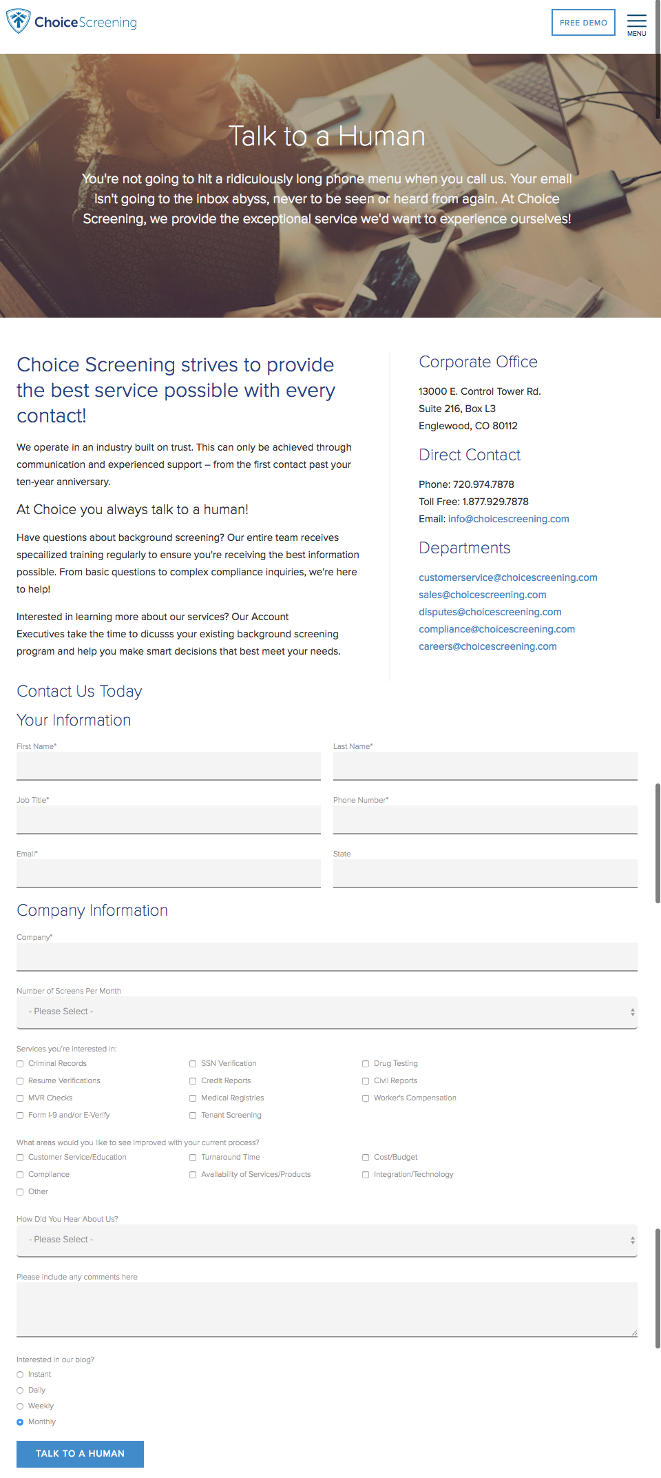
Choice Screening
Perhaps the best copy for a ‘Contact Us’ page that you can stumble upon today. It clearly says, “Talk to a Human,” and that’s what wins the heart of many. Not to forget how well-organized the entire page is with contact information for different departments, alongside the emails and a form follow-up. While the form may seem longer than usual, as the business runs background checks, it seems only necessary for the nature of their business. In fact, this may be one of those rare avenues where longer forms are taken as a necessity for collecting inquiries.
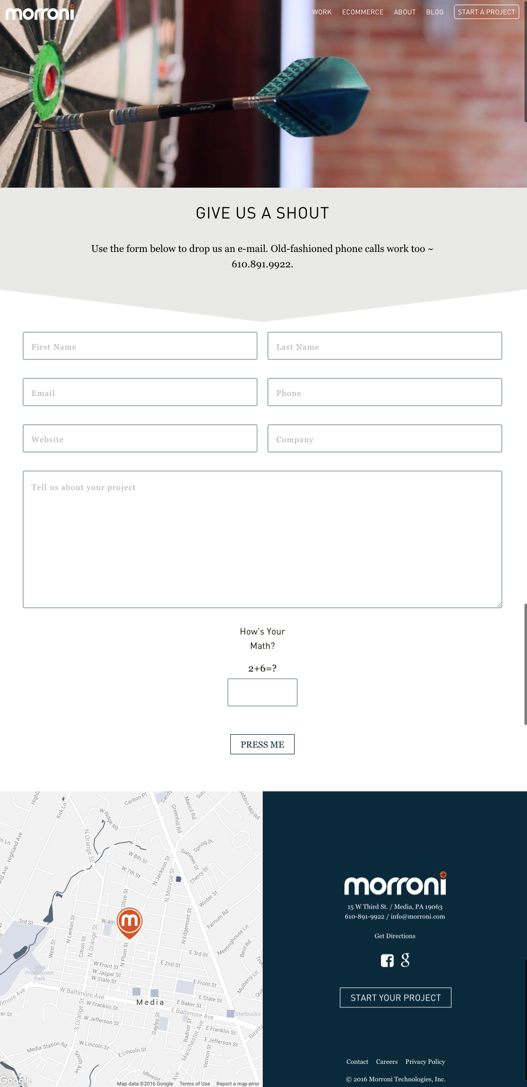
Morroni
When the talk is of the forms, how can we forget Morroni? Based on the solid idea that people would rather prefer filling out a form over getting on the phone and talking to someone. Just ensure that only the areas that really help the person contacting you to understand your business and eventually convert as a lead are required. Then there’s also a challenge-response test to figure out the humane side of visitors, which adds up to the simplicity and completeness of the design.
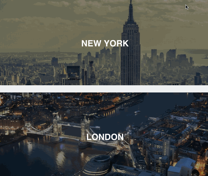
Dubsat
The classic customer service question, “How can we help you?” will always win our hearts, no matter what. It is quite obvious that a contact page is the best place to offer customer services, and that is exactly what people at Dubsat did. Then there’s a hero image on top, followed by a dropdown menu that completely personalizes the experience. Also, they did something very creative to make their page look like fun. On hovering your mouse over the cities where they have locations, the image changes to the actual location on a map, displaying the necessary contact information.
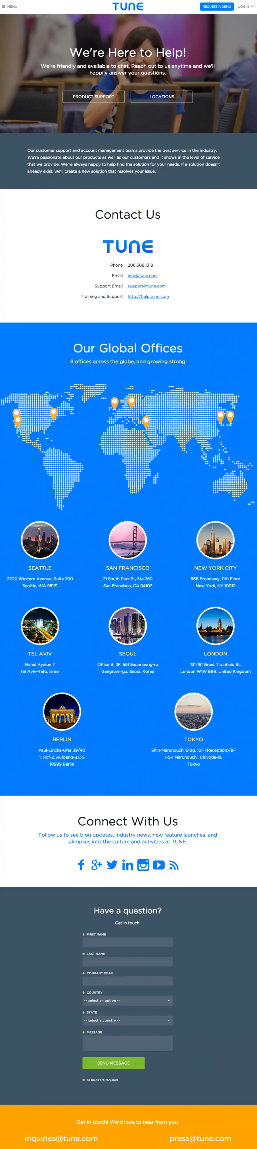
Tune
When it comes to the contact page of Tune, there’s so much to talk about – the carefully and beautifully designed page, perfectly placed calls-to-action, the visible contact information display and a form below the fold for entertaining the specific queries. The copy is a real winner too for a simple sentence like “We’re here to help!” and what follows are quite welcoming for visitors. There’s a warm friendliness about the copy that helps in building a relationship or at least taking the right initiative in doing so.
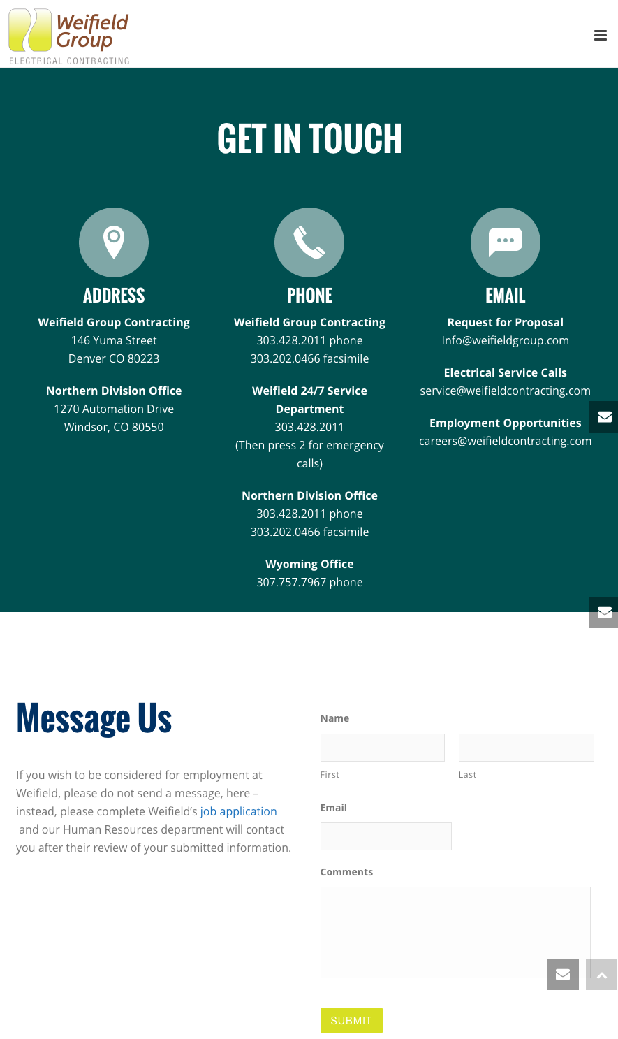
Weifield Group Contracting
With the push for mobile web browsing for better results on search engines, it has become a basic necessity for websites to go mobile-friendly, including the “Contact Us” page. In an effort to make your page favorable in that regard, brief forms, large CTA buttons for thumb-tapping, and simplified navigation are all preliminaries. Weifield Group Contracting has pulled this off really well. Their “Contact Us” page is a perfect example of a seamless mobile experience.
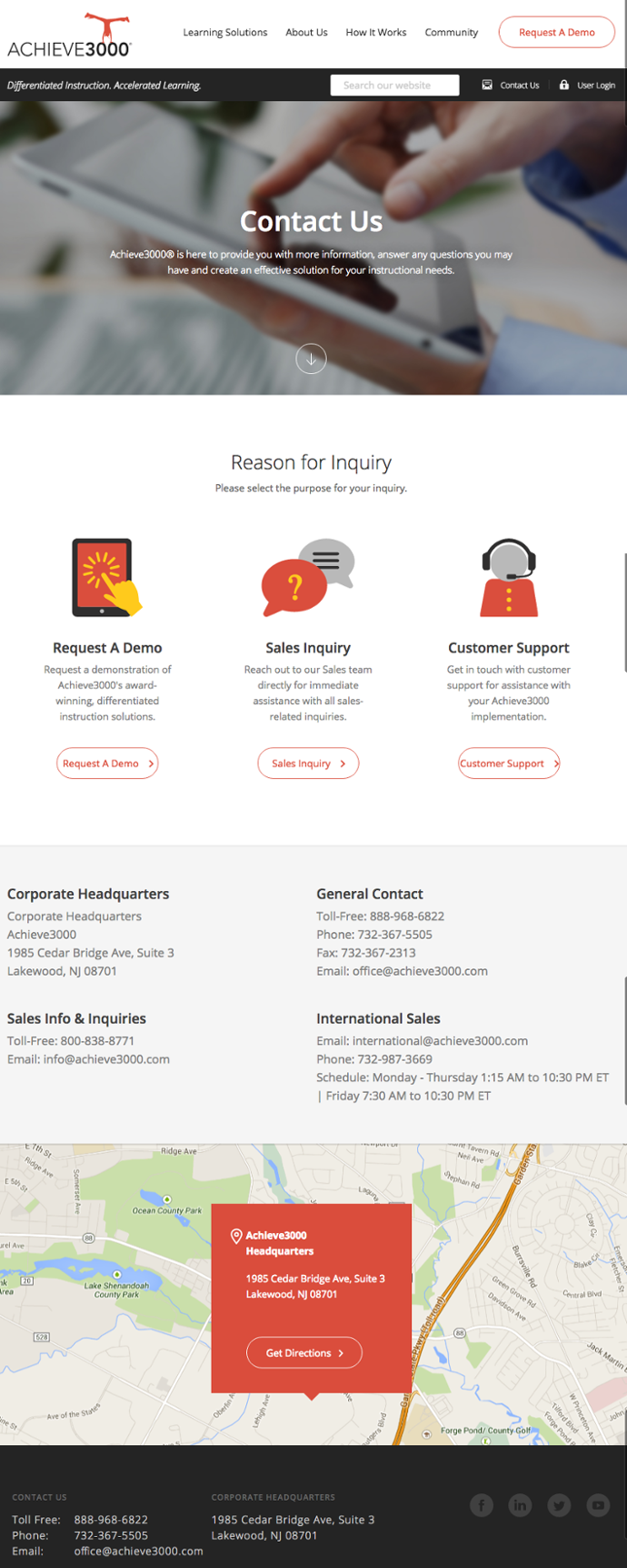
Achieve3000
Achieve3000 has various kinds of visitors digging into their website which is why they needed to fit in an approach that is in some way acceptable by all. A nicely pulled-off hero image is not the only thing that is a real charmer about their “Contact Us” page; what follows is even better: You have three choices: choose from requesting a demo, reaching out to a sales rep, or simply getting in touch with customer support. All of these options leads to landing pages of their own. To sum it up, it is a great way to cater to the common needs of various visitors.
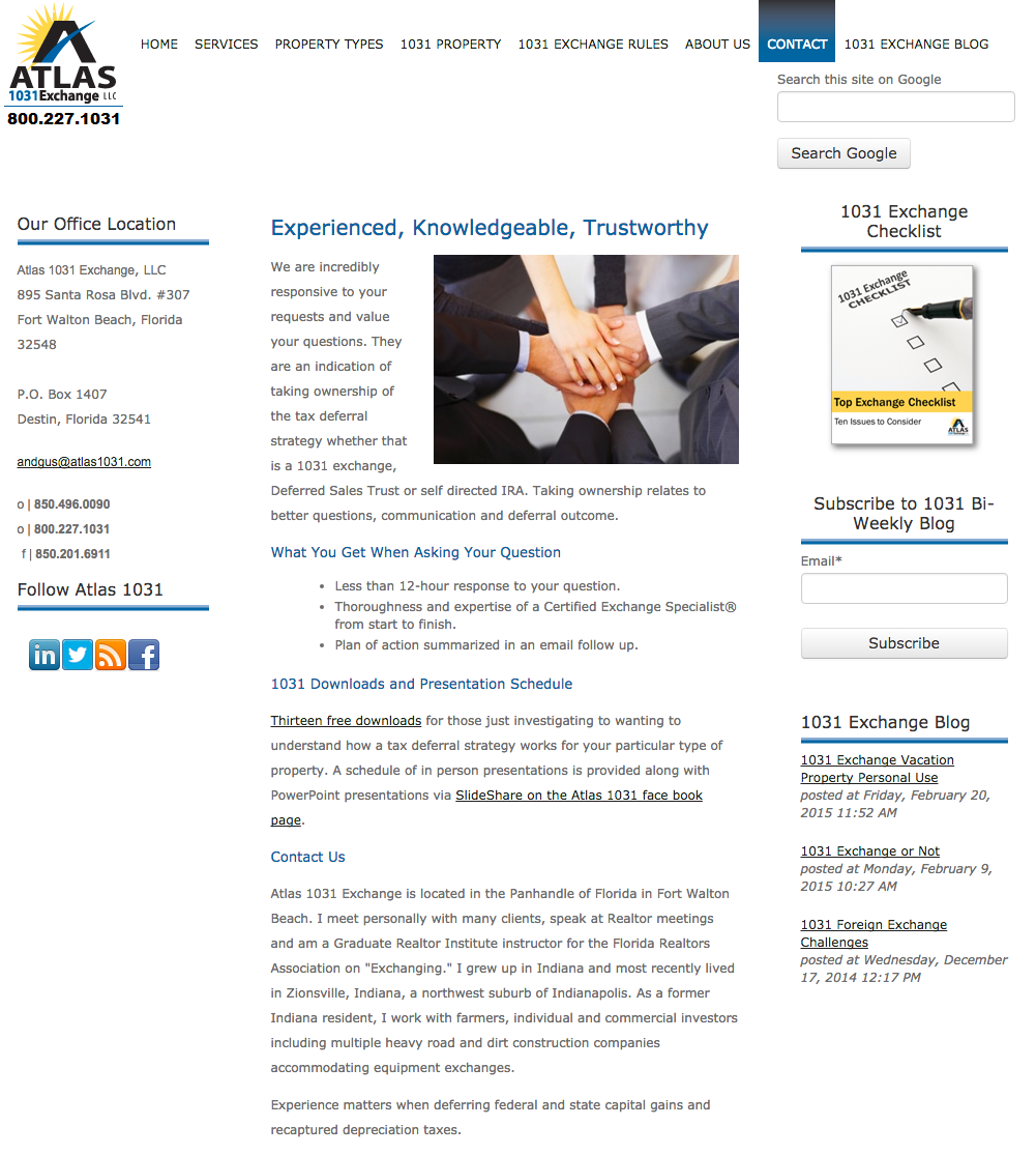
Atlas1031 Exchange
While the page for Atlas 1031 Exchange is not the most interesting page that you would stumble upon, there’s something else about their page that is appealing. It has all the qualities of a good “Contact Us” page, and that is what the real name of the game is. Explaining how they are utterly responsive to and value the questions, they have also mentioned a time frame for their response, which sounds professional and fulfilling. There are also social media buttons placed nicely, links for various offers, visible contact information, and recently published blogs—just perfect!
Pixpa
There are always those visitors who don’t want to fill out a long form in order to get in touch with you. To cater to such an audience, a secondary CTA can be placed that leads to your blog, a demo of the product, a video, or a how-to guide. A form that can be filled out with ‘lightening speed’ is the perfect idea to help such visitors connect immediately without testing their patience.

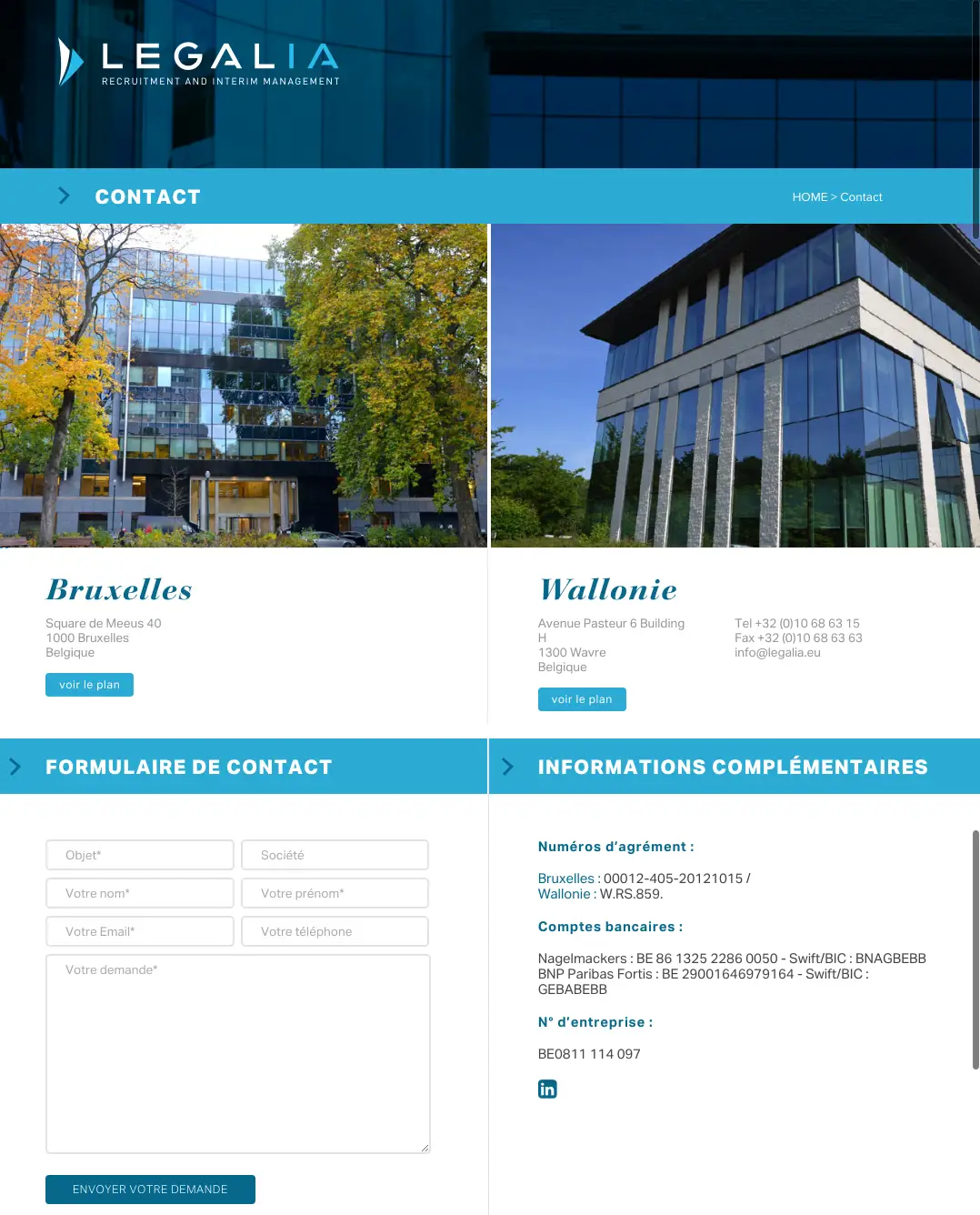
Legalia
A “Contact Us” page with a pristine feel and a functional design, Legalia sets a perfect example of a consolidated short form with only the necessary information confined in a small and clean space. A transformation of those large images of the building into maps for locations as you click the “voir le plan” (“view the map”) button is a simplistic approach towards presenting a contact page that is not overdone and is just right.
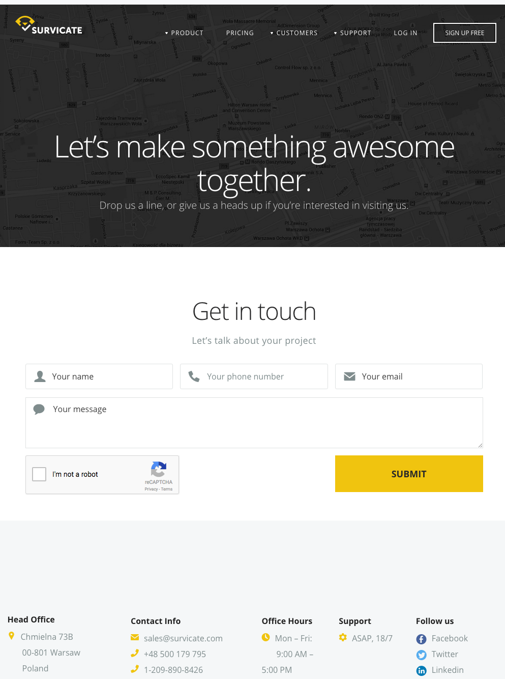
Survicate
A friendly, welcoming copy is what really complements the beautiful layout that sets out the perfect tone for a “Contact Us” page. You can learn from Survicate to create a conversational tone that will set you apart and make your visitors feel closer to your brand. The form on the page is also simple and to-the-point with a yellow-colored CTA that reflects the logo—very impressive. To add a cherry on top, the page is mobile-friendly, which makes the page exemplary.
Takeaways
- Let’s quickly take a look at the takeaways from the above examples:
- Be welcoming about letting visitors contact you and how you can be a problem solver to them
- Don’t forget to include an email and phone number
- Insert a short form (or longer if it deems fit given the nature of your business)
- Include a call-to-action in order to keep people to your website
- Add links to social media accounts to give visitors a chance to interact with the business
- Give a reason to the visitors to contact you by showcasing your thought leadership
So go about recreating your “Contact Us” page for better leads today. You can thank us later!


